Calls to Action That Work: 7 Tips That Increase Conversion
Calls to action (CTAs) are one of the most crucial parts of your whole website. Yet, they’re often treated as afterthoughts.
Neglecting these integral parts of your site would be like hiding the cash register in a store. Presenting aisles upon aisles of gorgeous products and displays is pretty worthless if people can’t figure out how to purchase them.
The same could be said for CTAs. They’re the doorways that lead to your organization’s success - Buy Now, Call Us, Register, Donate, etc. So we should make them as enticing as possible.
Are the extremely common examples above enticing anyone? Nah, probably not. But they could be... with just a little tweaking.
What Is a Call to Action?
A CTA is any place on your website where you tell someone to take the next step in getting involved with your company - purchasing a product, making a donation, calling, requesting information or creating an account.
Often CTA text is on a button that leads somewhere else. For example, “Get Quote” might be a button that takes visitors to a form to input information about their needs.
While most CTAs we see are quite functional, they’re not very persuasive. It may help to put yourself in the mind of your customer or just think about your own experiences. Remember that getting involved with a new business can feel a bit risky.
At the very moment before clicking/tapping that CTA button, people are thinking, “Will this company meet my expectations? Will the product or service be right for me? Will I be wasting my time or money?” Those are big, scary questions.
So, it’s up to you to make that moment feel more inviting, reassuring and exciting. And you can do that by avoiding the same old, boring CTA language in favor of copy that encourages people to take the important action that leads to your company’s success.
Tip 1: Use First-Person Point of View
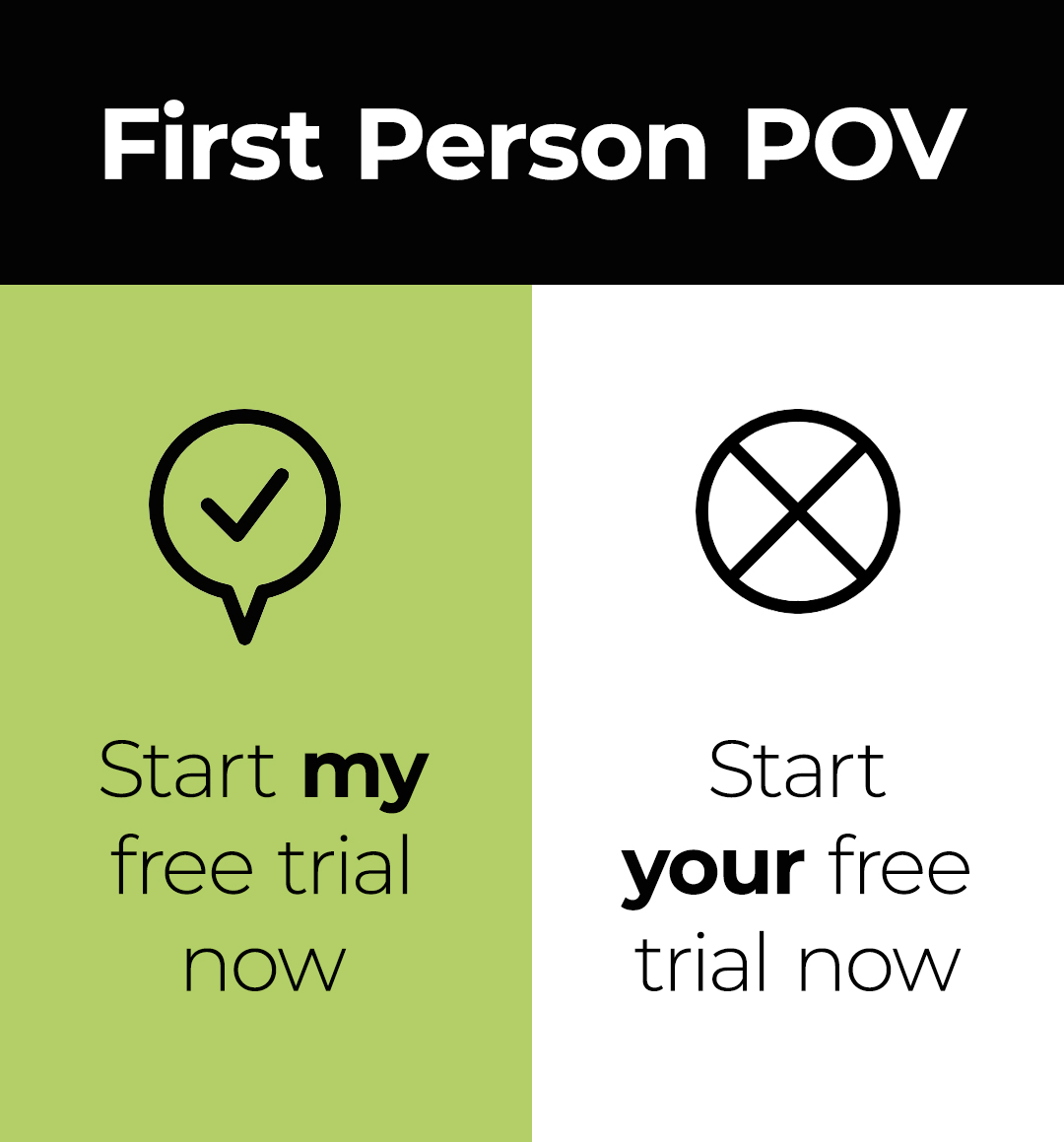 When writing CTA copy, it’s common to write as if you’re speaking to the website visitor. However, the call to action should be more intimate and be written from the perspective of the visitor. So instead of, “Start your free trial” it should be, “Start my free trial.”
This isn’t just our opinion. In a recent A/B test, a CTA written in first-person (I/me/my) got a 90% increase in click-through rate when compared to the same CTA written in second-person (you/your).
But why does this work so well?
- It stands out - Most website and CTA copy is written in second-person (“You’ll love our products!”). So anything written in first-person point of view (POV) serves as a pattern interruption and grabs your visitor’s attention.
- Creates a more personal connection - Making a human connection through a website is a challenge, so anything you can do to make it feel more personal is helpful. Using first-person language creates an intimacy that inspires trust.
- Puts the visitor in control - Keep in mind that taking the next step with your organization can feel like a risk. Using first-person POV gives visitors a feeling that they’re in control and making the right decision.
- Helps them visualize the action - What you’re offering is desirable and the visitor wants it or they wouldn’t be considering taking the action. Writing the action from their perspective helps them to envision getting the thing they want.
Tip 2: Use Compelling Verbs
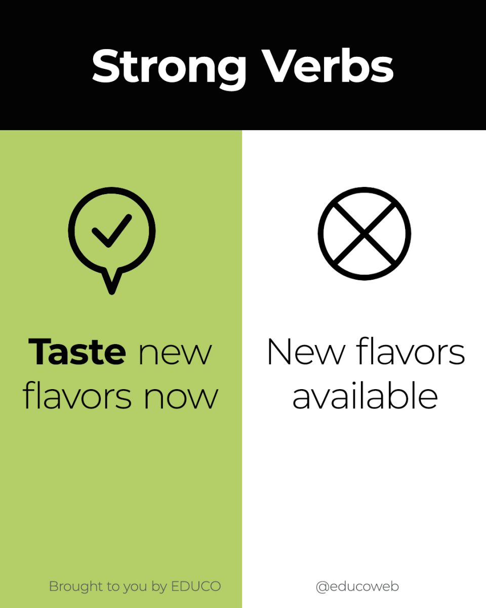
Passivity has no place in calls to action. At that critical moment, your visitors need a little push to take the action you want them to take. Which would inspire you to click more: “Taste new flavors now” or “New flavors available”?
Most people would respond more strongly to the thought of doing something exciting, like tasting a delicious new flavor. Just letting someone know that something is available is weak in comparison. Bottom line, your calls to action should literally call visitors to action.
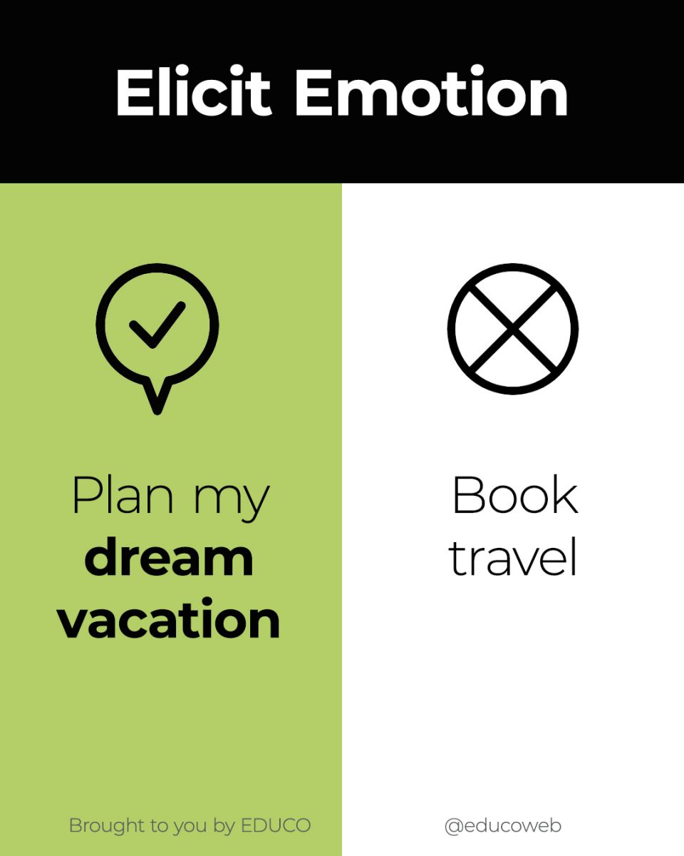
Tip 3: Elicit Emotion
Most of our purchasing decisions are rooted in emotion. Sure, you buy a new car because your old one broke down. But you opt for the more expensive model because it makes you feel cooler or younger or more eco-conscious.
The CTA is the perfect time to remind people of the emotion that’s lurking just below their decision-making logic. Let’s imagine a travel website whose main CTA is, “Book travel.” That’s pretty uninspiring and sounds logistical rather than aspirational.
Travel is exciting… and expensive. When we’re on the verge of dropping hundreds or even thousands on a trip, we want to feel thrilled. So a better option might be, “Plan my dream vacation now.” This sort of language conjures daydreams and makes us giddy to move forward.
Tip 4: Make it Sound Easy, Fast or Affordable

Many users stop on the verge of a purchasing decision because they’re worried that something will be difficult, confusing or expensive. Keep these objections in mind as you craft your CTA language.
If you know that your potential customers are particularly wary of a complicated application process, your call to action could say something like, “Apply now in just 5 minutes.” You’re calling your customer to action while simultaneously reassuring them that it won’t be as hard or time-consuming as they think.
Tip 5: Focus on Results
People don’t just want the product or service you sell - they want the result it will get them, and the result is far more valuable.
A university that caters to adult career-changers could have a CTA that reads, “Apply to our degree programs now” but that doesn’t touch on the why. It would be much more powerful to say, “Start the path to my new future” or, “Find my perfect career path.” These speak to the underlying reason people are there and what they really want.
Tip 6: Create a Sense of Urgency
A tale as old as time, urgency in marketing will never go out of style. It can be done in a tacky way that turns people off, but it still works when used correctly.
It’s common to hem and haw before making a purchasing decision, especially if it’s a big one. One effective way to spur people on is to let them know that they don’t have forever. Do this by using CTAs like, “Buy now while supplies last” or, “Sign up by Friday to get 25% off.”
These sorts of CTAs may not make sense for all industries, but you should experiment to see if you can find a smart way to incorporate a touch of urgency into your CTAs.
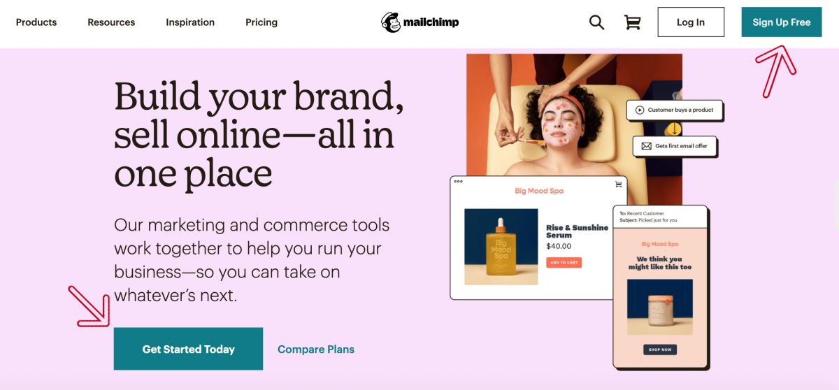
Tip 7: Make It Visually Appealing
Even the most compelling, well-written CTA won’t do much for you if it’s not well-designed too. First, your calls-to-action should have a style that matches your overall website design. And here are a few other tips that should help them get noticed and clicked:
- They should look clearly like buttons or links. Make it very obvious that users should click/tap on the text to take the next step. This is not the place to be cute or clever with design.
- Feature the same CTA in multiple places on your website, using the same design and wording for all. There might be multiple things you’d like your website visitors to do, but try to focus on the most valuable one and repeat it throughout your website.
- If you do feature other CTA buttons, make their design less prominent than the main one.
- Use contrasting colors to make the button stand out. Some studies have shown that certain colors work better (greens and oranges, for example), but the most important thing is to make sure that the button stands out from the background and the text stands out from the button.
- Opt for larger text and lots of white space. Your CTA text should be clearly legible, and adding blank space on either side will make it stand out more.
- Use graphics or images to help draw attention to it. One smart tip is to feature a photo of a person whose eyes are directed at the CTA button. Otherwise, even just an arrow pointing at the button can help.
- Test, test, test! Sometimes very small changes in CTA buttons can make a huge impact. If yours aren’t getting clicked enough, experiment with the design.
Course of Action
This may seem like a whole lot of thinking and work to do for just a few words on your website. But trust us when we say that these little words can have a huge impact on your business. And getting them right could increase your new business opportunities by leaps and bounds.
We recommend doing some experimenting to see if improving your calls to action makes a difference. But if you’d like some professional help, get in touch and we’ll step in to craft effective CTAs that are designed to convert.