17 Web Design Trends in Commercial Construction 2024
In our constantly evolving digital landscape, where trends emerge overnight and the quest for optimal user experiences never ceases, staying up-to-date with the latest trends is crucial.
When it comes to construction companies, the challenge lies in finding the perfect balance between visual appeal and informative content.
- Does your customer base respond to pushing boundaries or staying within the lines?
- Do you state your brand purpose explicitly and clearly?
- How are you staying competitive in the diverse commercial construction marketing landscape?
To help you answer these questions, we've looked at 253 commercial construction companies' websites to see what's trending and to help you find your next big move. Here are the findings:
Web design trends in commercial construction:
- Breaking the Grid
- Centered Logo
- Clear Main Navigation
- Colorful Gradients
- Custom Photography
- Feature + Background Videos
- Grid Layouts
- Joint Venture Microsites
- Layering
- Micro-Animation
- Minimalism
- Mobile Only Navigation
- New Safety Helmets
- Scrolling Effects
- Social Icons in the Footer
- Social Proof
- Unique Bold Brand Messages
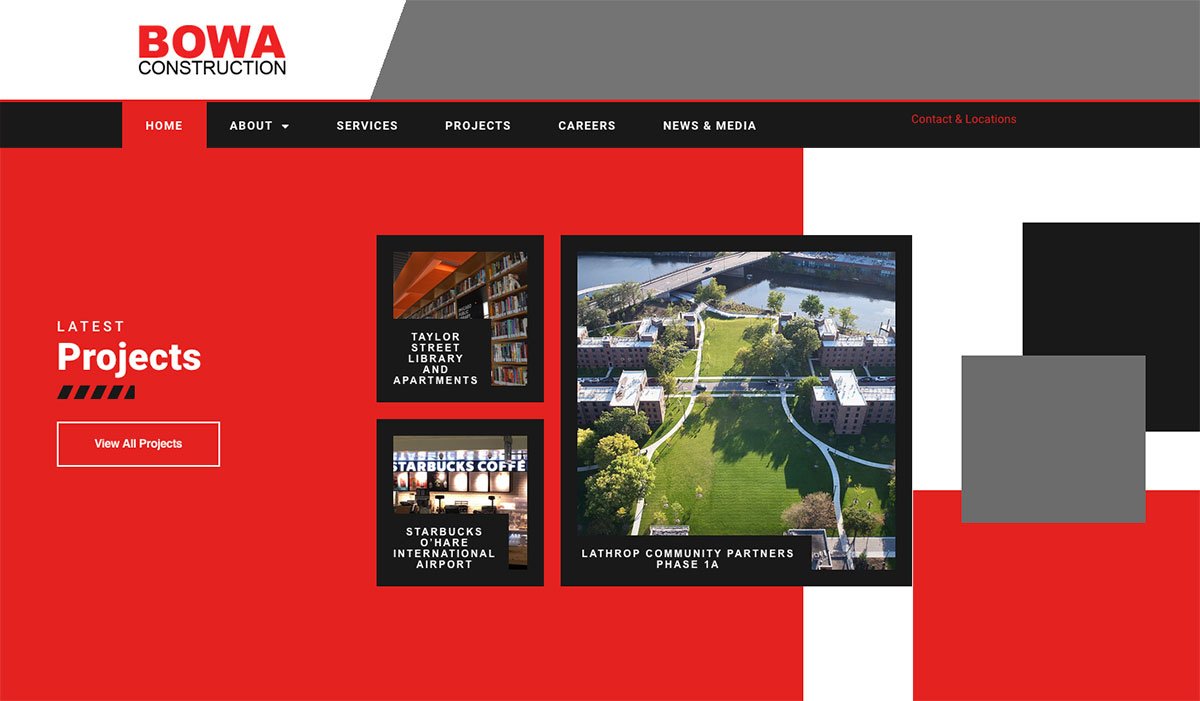
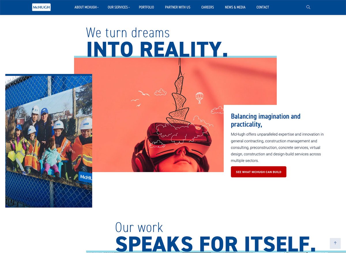
Breaking the Grid
The desire to break the typical website grid layout continues to creep into the minds of marketing teams. We increasingly hear designers from commercial construction companies want to leave the consistency and predictability of the usual columns and gutters of the grid-style layout.
Whether you call it breaking the grid or hiding it, we see content sections overlapped and less of that predictable boxy look you see on many DIY website platforms.
While there are a number of companies adopting this approach, Bowa and McHugh were two commercial construction companies we found adopting this approach well.
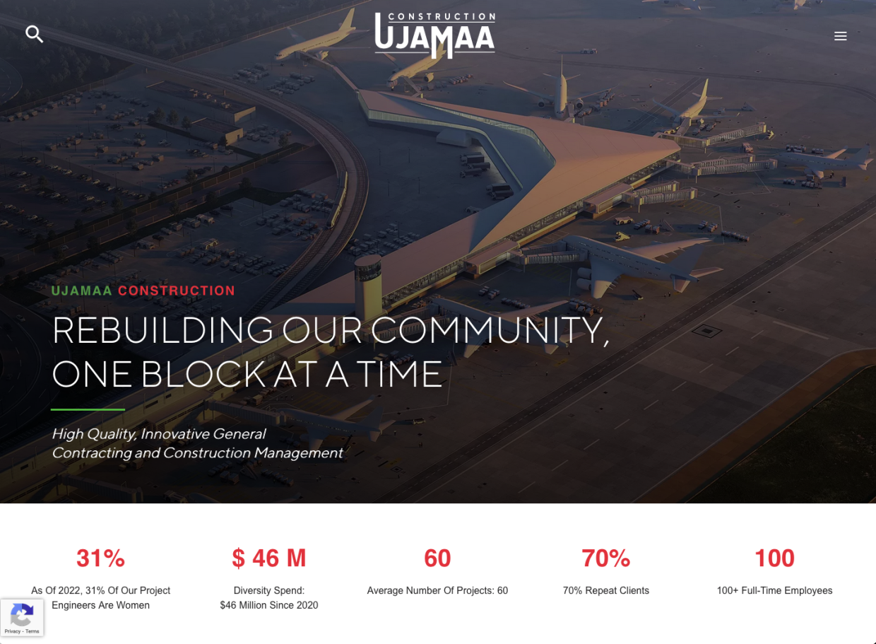
Centered Logo
This post-COVID world is causing designers to reconsider everything. Designers are implementing anti-design styles, including returning to a Y2K era aesthetic, trying more brutalist design layouts, playing with ultra-minimalism, and trying experimental navigation. Considering that - centering the logo sounds pretty tame.
Even though Nielsen Norman Group says centered logos can present navigation usability challenges (specifically in finding the homepage) as more sites go mobile-only, this may be a trend we'll continue to see more sites adopting.
Ujamaa Construction applied this trend nicely by removing clutter and letting the featured image and messaging take the spotlight. A few others trying out the centered logo include: Gallant, and Moriarty.
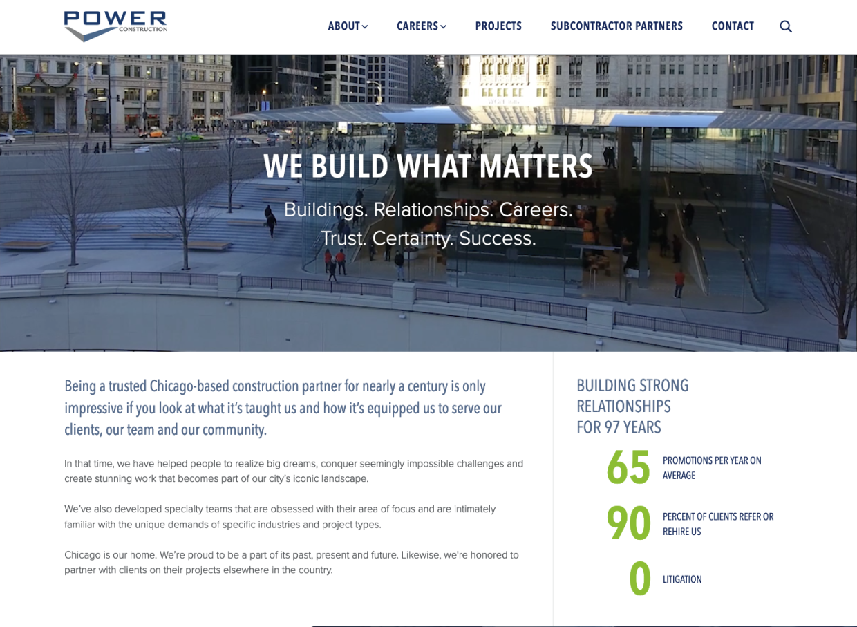
Clear Main Navigation
Navigation, or nav for short, is not really a place where you want to get super creative. Clear navigation is challenging but a sign of a considerate website.
It's hard because many team members want to weigh in on it but never want to consult the end user. And your target user's opinion is absolutely the most critical. With Google now factoring user experience into their Page Rank algorithm, creating an easy user experience is more important than ever.
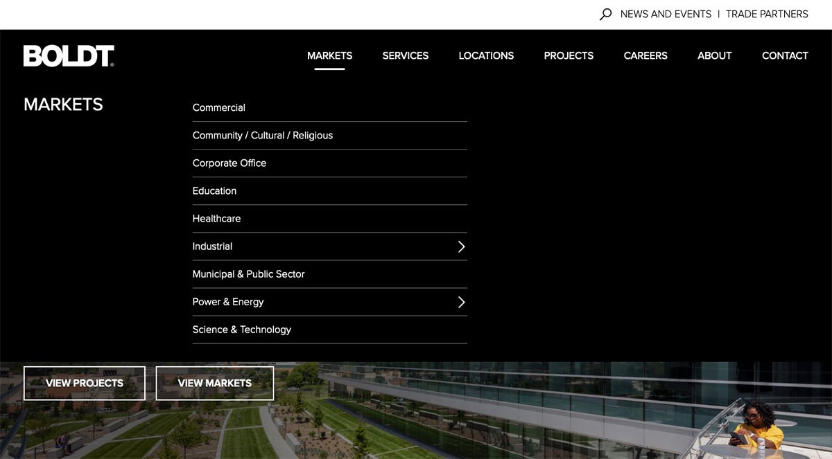
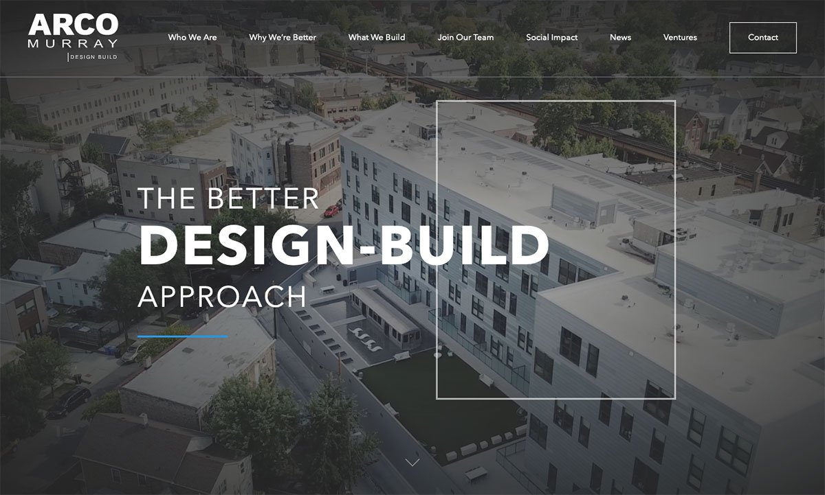
Power Construction is doing incredibly well at keeping its main navigation accessible for users to find their way around. A couple of others with nice clear main navs were: Boldt, who took the clear navigation a step further, and Alpha ordered their dropdown navigation items (chef kiss). ArcoMurray took a very different approach and eliminated dropdowns altogether, which works well too.
Colorful Gradients
Digital design went distinctly flat for a while in the early 20-teens, but in 2018 gradients came back, and they have been popping up all over.
They can certainly be overdone, and you want to watch colors that vibrate too much on screen as this presents an accessibility issue that can impact your Page Rank, but tasteful gradients will be in for a while.
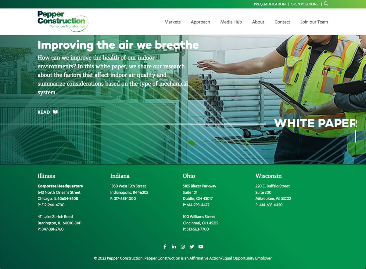
We are a particular fan of the way Pepper's design team has been applying them to their corporate site and in their annual reports.
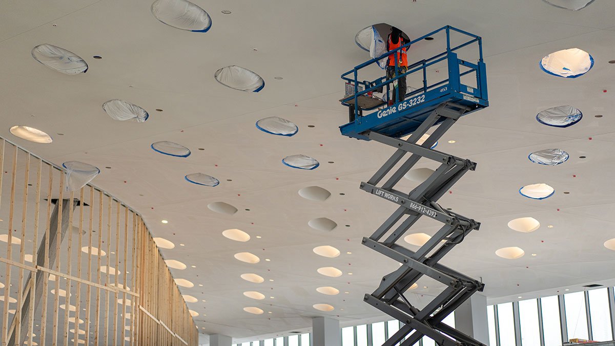
Custom Photography
There is nothing quite like being on a job site. NOTHING. The closest you can get is the custom photos and footage.
There has been a real departure from using stock photos, and we love this desire for more custom visual storytelling and putting forth the effort for more authentic organizational imagery. It's everywhere. The only sites using primarily stock images look like they were last updated in the early 2000s.
One request to photographers and content managers - please compress and optimize your images for the web to keep the user experience as smooth as possible because Google will ding you if you upload large photos that cause slow load times or cause accessibility issues.
Free Compression Tools
Image Optim is a great compression tool for Mac users. There is also TinyPNG which is a free online tool for image compression. You can use EZGif, a free online tool for compressing animated gifs. Hopefully, you can incorporate these into your content workflow before uploading images.

Featured + Background Videos
Video is really taking off. We're seeing it more integrated into featured homepage sections and in the background of other website content sections.
Marketing managers are abandoning the old rotating carousels in favor of compelling movie clips cut together in a glorious never-ending loop.
This is also an opportunity to provide a singular strong static statement and the moment to connect with the audience. All the alliteration aside, builders are obtaining some of the most epic footage from their job sites and creating inspiring visuals to tell how they bring their client's visions to life.
Featured Videos
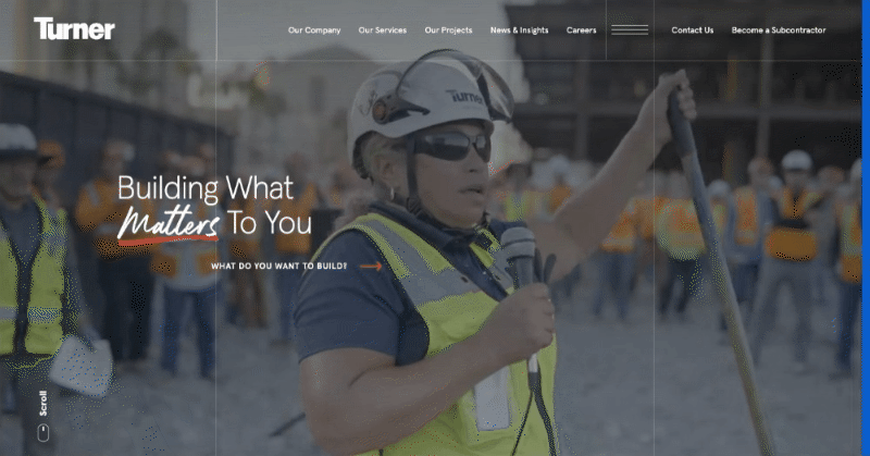
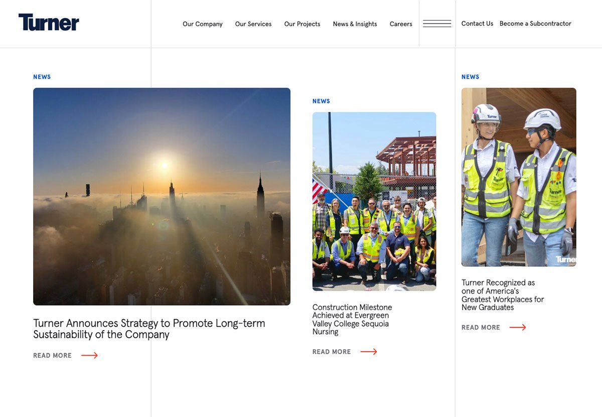
Turner just launched their new site, and while they're not using background videos in any content sections, they did commit to using them in the featured section of their homepage.
Background Videos
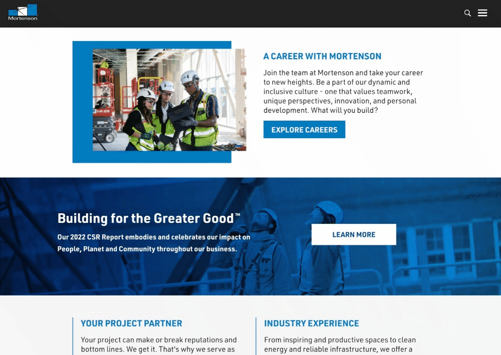
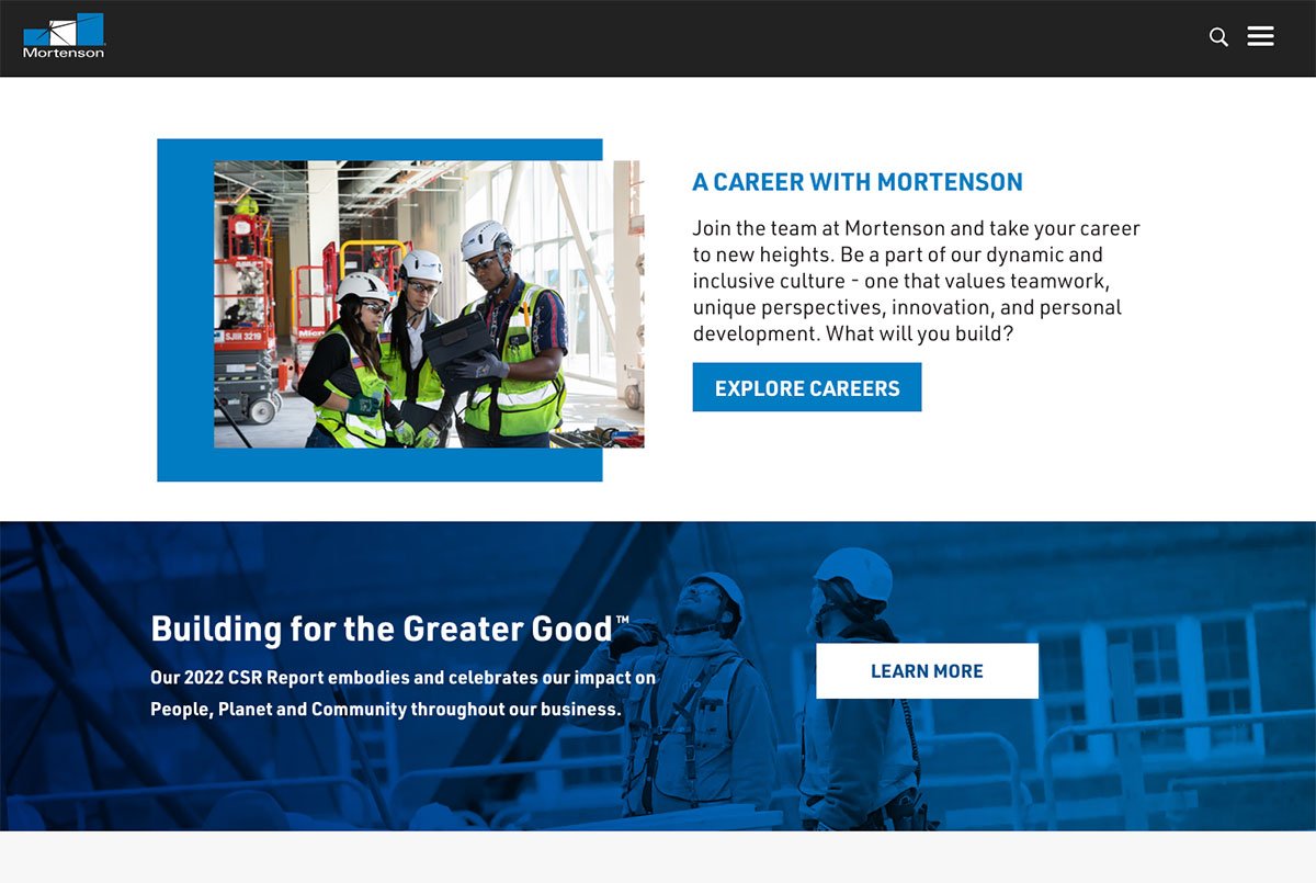
Mortenson applied a nice background video to a content section on their homepage.
Video can help keep people's attention. But it can also be distracting and weigh down your website's load time and performance.
Without getting into the technical details - Whether you're planning to use video in your homepage feature section or in other content sections on your website, you'll want to be sure and add proper fallbacks for those website visitors that don't have accessibility issues, make sure your videos are compressed and optimized for the web and please never add audio.
Grid Layouts
With more sites turning to Wix and Squarespace, we see websites sticking to the grid. Grid layouts divide web pages into columns and rows, and distinct sections. Grid layouts provide a lot of benefits.
- They bring efficiency and help speed up the design process because the designs are more predictable and replicable.
- They improve usability by providing a consistent framework that ensures users can understand and navigate pages.
- It brings flexibility because designers can vary the number of sizes and columns, and blocks for each website.
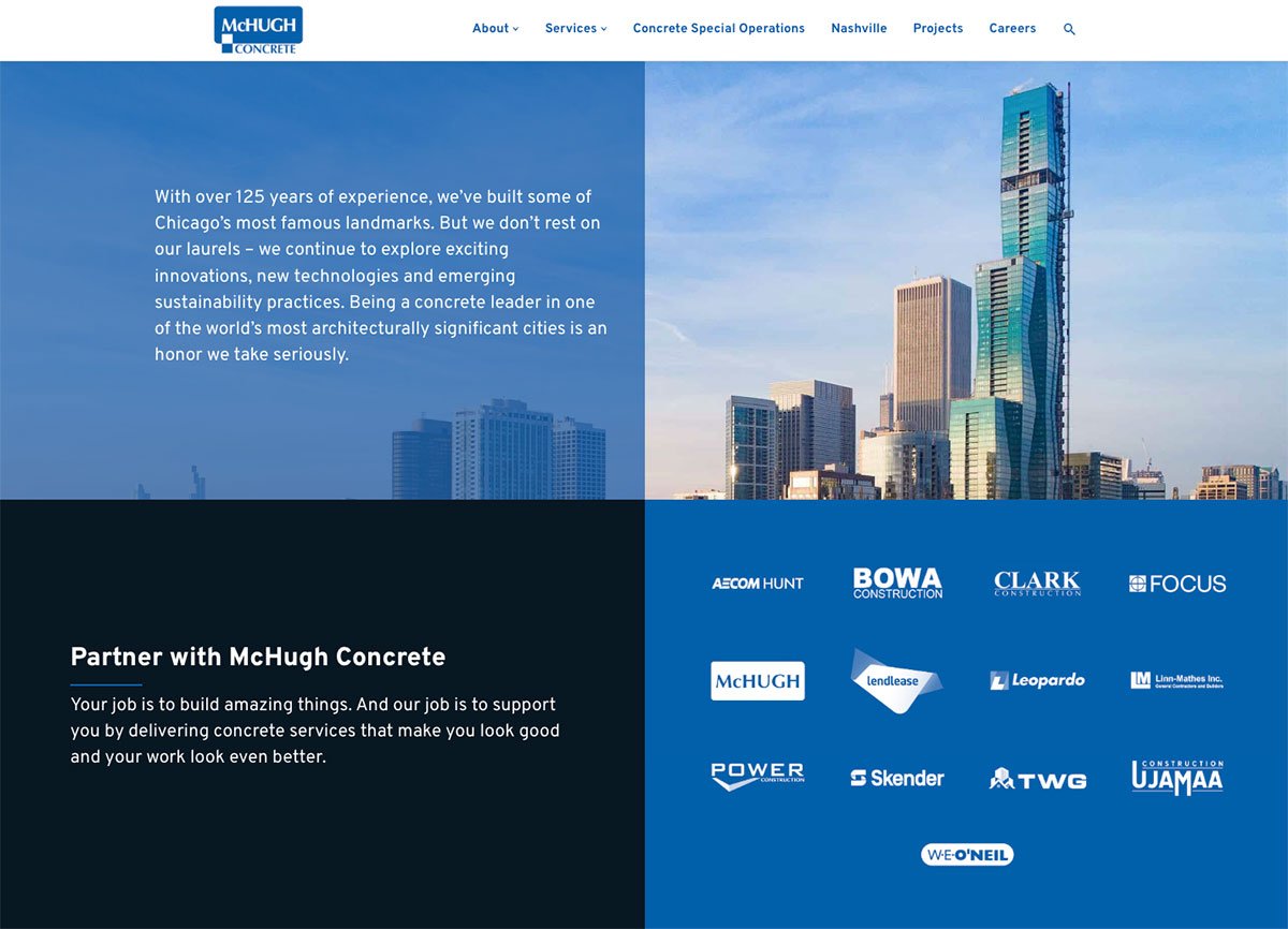
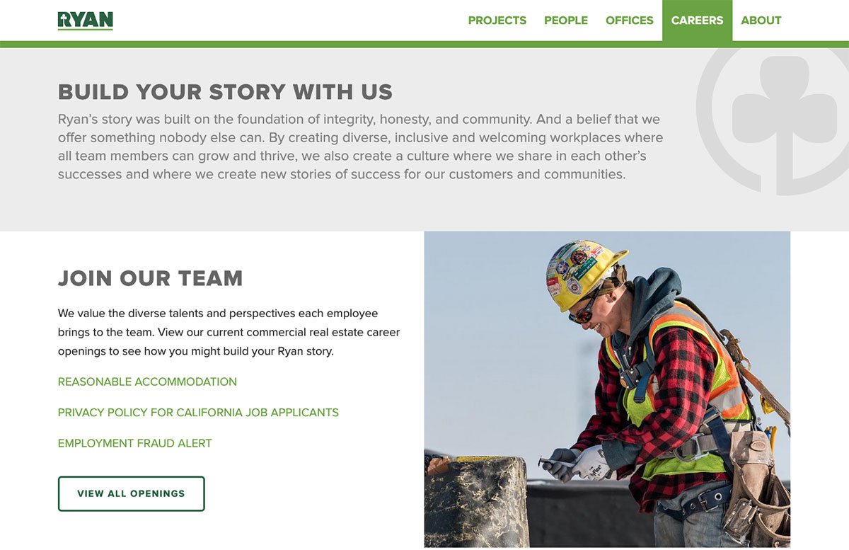
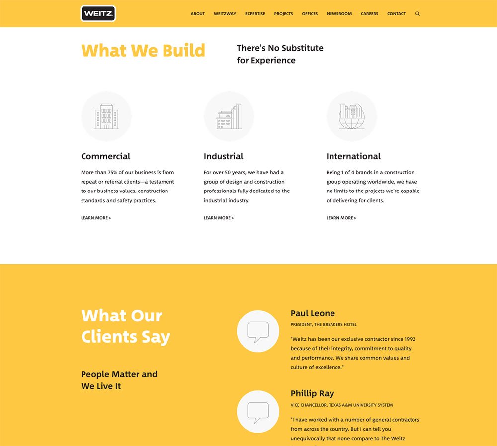
McHugh Concrete, Ryan Companies, and Weitz are a few sites that stood out using a more traditional grid layout. Some other commercial contractors using a grid-style layout are ArcoMurray, HenryBros, IHC, GE Johnson, Graycor, Lendlease, Reed, Skender, and Wight.
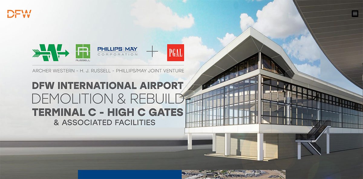
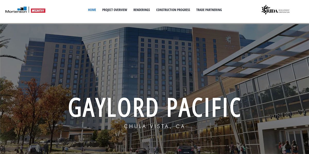
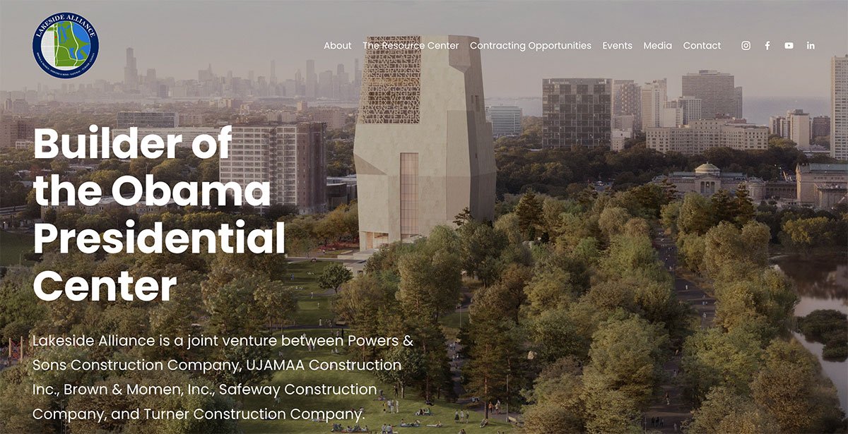
Joint Venture Microsites
Commercial construction is known for creating solid partnerships between builders, and that trend is not going away.
And with those partnerships come microsites.
A few that stood out were the Lakeside Alliance for the Obama Presidential Center and The Mortenson McCarthy JV Partnership for the Gaylord Pacific Hotel and Convention Center. Here are 9 recent commercial construction joint venture partnership microsite examples.
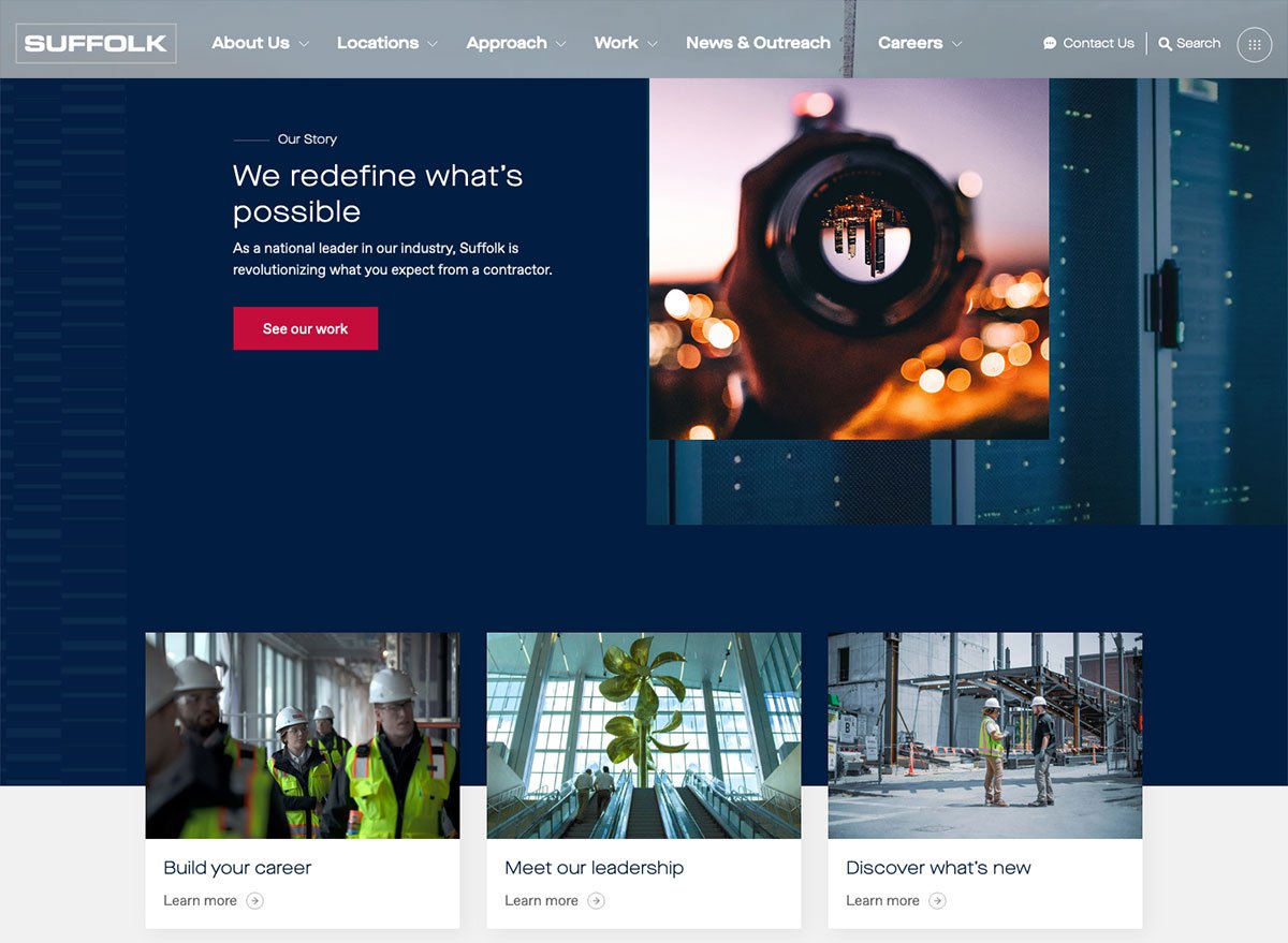
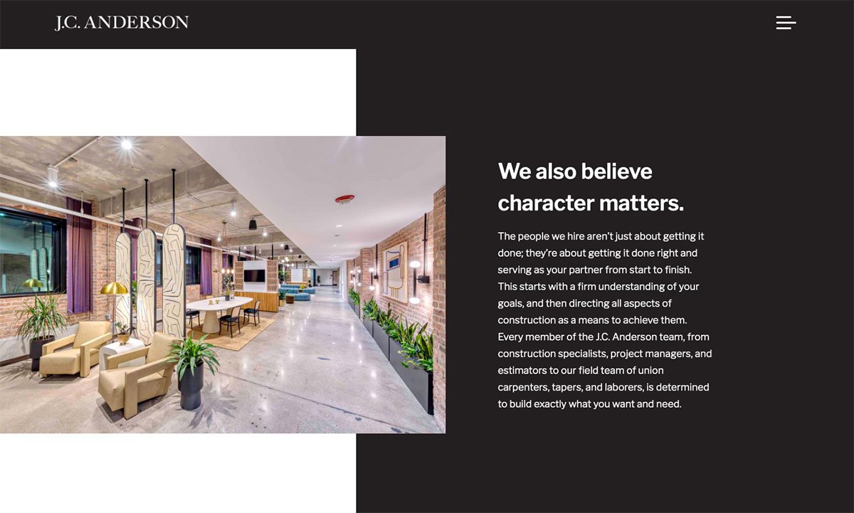
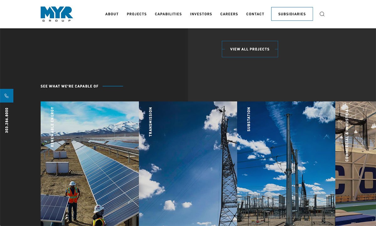
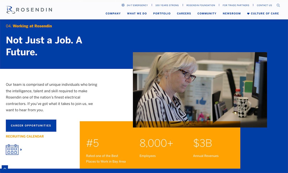
Layering
This is somewhat related to the broken grid trend, but it has more of a scrapbook vibe in some cases. Whether it comes from a desire for nostalgia or drawing on a desire to break out of the grid design, it can bring a lot of dynamism to your website's content.
Suffolk does an excellent job of blending a somewhat grid layout while adding content sections that layer elements. Some other commercial contractors using layering in their web design include J.C. Anderson, MYR Group, and Rosendin Electric.
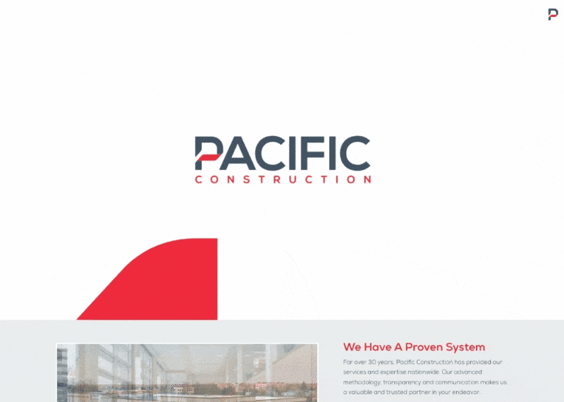
Micro-Animation
Whether animating the organization's logo or the divisions within a construction company, there are many little ways to work in dynamic movement that bring some nice zhuzh.
Pacific has utilized an animation effect of their logo and featured a homepage content section. Power Construction also has a nice animation of their company divisions on their homepage below the scroll.
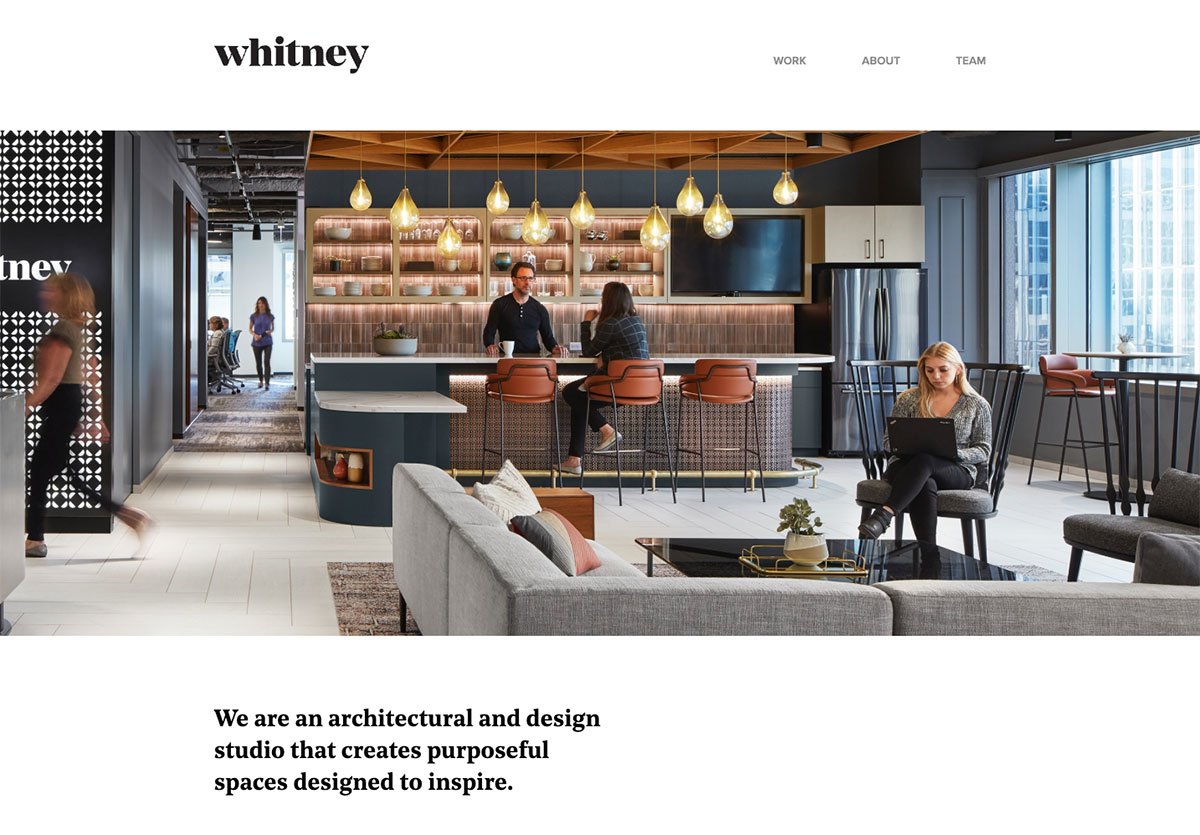
Minimalism
Minimalism is a fringe trend in construction web design. We could only find one contractor group trying minimalism out, IAI.
The A's in A.C.E. are definitely embracing a less is more approach. As the time is always ripe to respect our website users' attention and be concise, this trend might have some legs for GC's.
Minimalism also checks another box for marketing teams because it constrains the content that needs to be produced and agreed upon.
Whitney Architects is an excellent example of an architecture group that leaned into a minimalist layout.
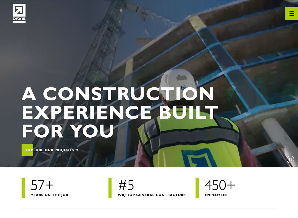
Mobile Only Navigation
Despite the fact that this trend is a bad user experience (UX), that won't stop site owners from adopting it.
Advocating for Mobile First over Mobile Only is more inclusive. We want to design an experience that looks good on every device because there are still desktop users. Mobile Only navigation can leave something to be desired on the desktop. We've implemented Mobile Only navs for a few clients and later reverted back to a more traditional menu because many of their visitors came to the homepage and left no realizing the mobile nav was an option.
Not all of you may remember this, but in the early days of websites, there used to be a 'Home' link in the main navigation, and now the company logo has essentially replaced that 'Home' page link. Who knows, maybe the Mobile Only nav will also become the new norm, but for now it is questionable UX.
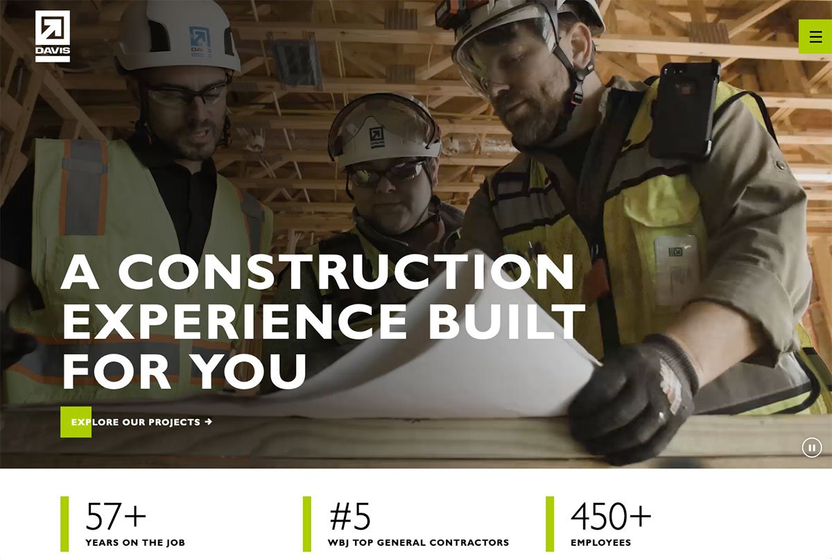
Clay Corp, Kewit implemented a mobile-only nav. Other construction groups currently testing Mobile Only navigation include Davis, J.C. Anderson, Krusinski, and Ujamma
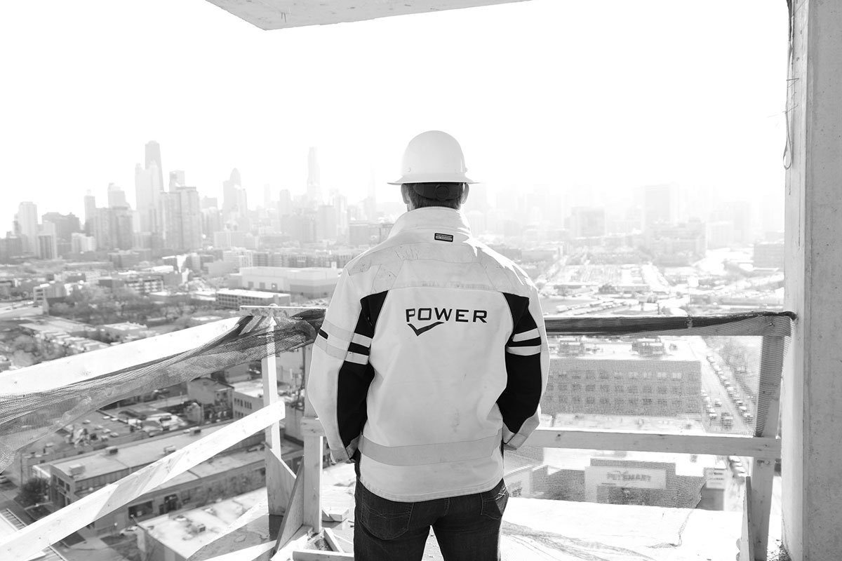
New Safety Helmets
While this isn't a web design trend, it is a trend that will start impacting website content (specifically photos and footage).
Although OSHA regulations do not yet mandate it, many commercial construction companies want to get out before this change takes effect and require contractors to wear the new safety helmets to set an example to the rest of the industry.
Whether you want to be a leader or just not get left behind here are some groups starting to feature the new safety helmets in their photos and footage Davis, Moretenson, and Turner.
Scrolling Effects
These effects are animations triggered by scrolling action. They provide a little dynamism to web experiences. They are becoming a popular trend in website design. Websites increasingly use these effects to intrigue readers to keep scrolling, signify a break in content, and create a three-dimensional experience.
Scrolling effects can't save poor content but can make a site more delightful.
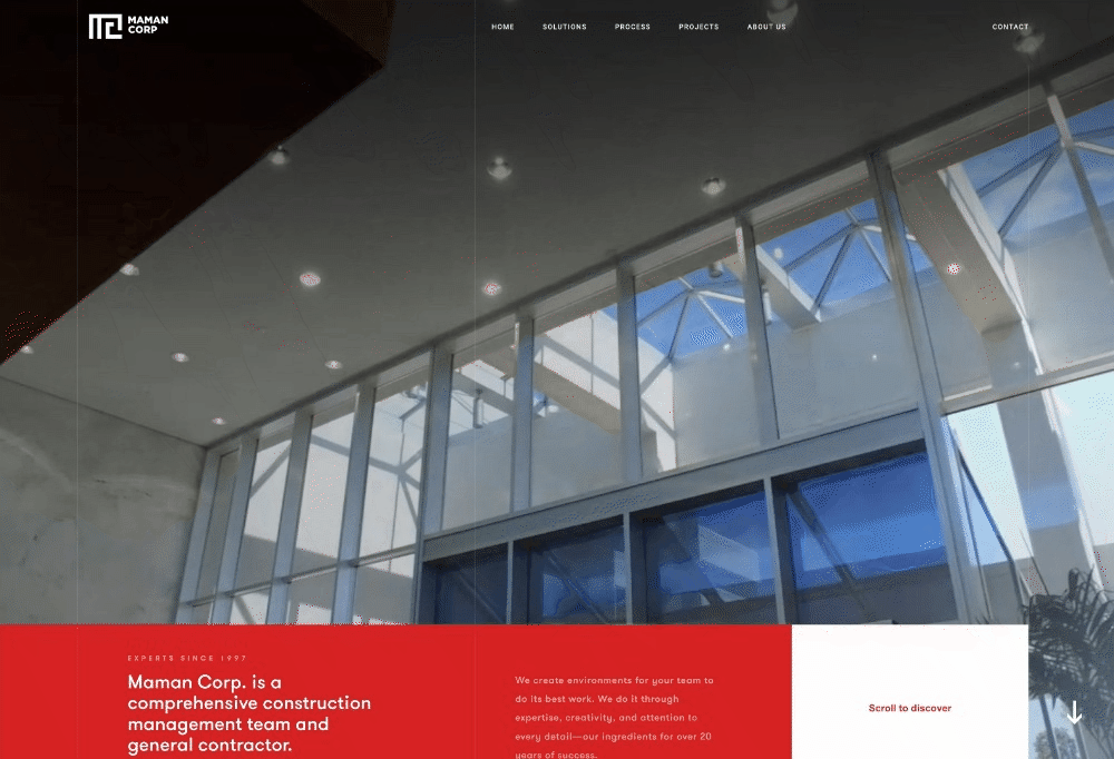
Maman Corp had some very well-done scrolling animations. A few others had nice scrolling effects ranging from subtle slides or fade-ins to more dramatic versions: Bulley & Andrews, Davis, Michels, and WE O'Neil.
Social Media Icons in the Footer
Organizations have put their Social Media Icons in the main navigation ever since Social Networking became a thing.
Now we are seeing organizations realize that the point of their website is to engage their audience rather than to send users off to these social media platforms.
Bless those design teams and marketing managers for moving the icons to the footer.
Many are already starting to follow this trend, but Boldt was a straightforward example of moving social icons down to a clean footer. This trend is more common on newly redesigned websites. Only older sites have social icons near the primary navigation or above the scroll.
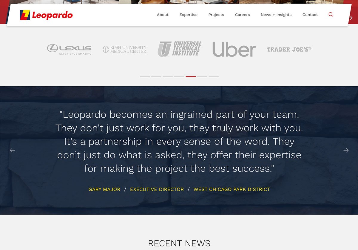
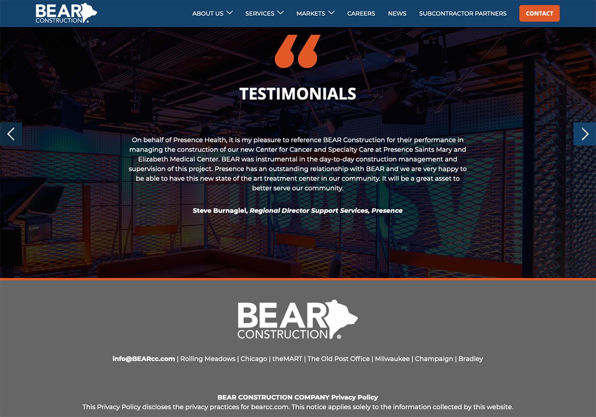
Social Proof
Testimonials will always be more credible than a company's marketing words. The voice of the customer brings a uniqueness that we, as marketers, cannot and should not try to replicate. They sound candid and can cut through all the fluff and speak to other users in a similar situation about the value they got from choosing your company.
While Social Proof is an emerging trend in the commercial construction space, according to the Content Marketing Institute, most B2B organizations plan to invest in testimonial or social proof-centric content.
Organizations often make claims in their website marketing copy. If you're not planning to back those claims up with data or social proof, your competitors will be.
Leopardo was one of the very few companies using social proof on their website. Bear Construction has also prioritized testimonial content in its recent redesign.
If they wanted to step it up, they could add:
- A subhead or a title
- A photo of the person
- And/or the company logo
With that said, knowing just how challenging getting a testimonial alone can be, it's understandable that those other items might not be possible, though they do add a lot of personal credibility.
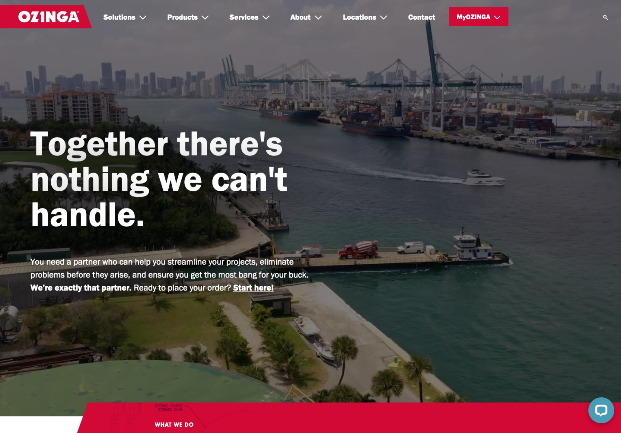
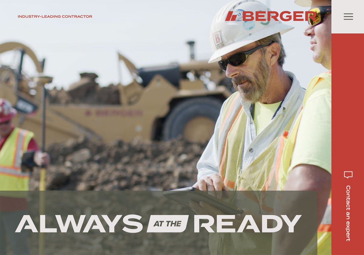
Unique Bold Brand Messages
A small brave number of websites are using a solid featured homepage message that aims to inspire. It's worth clarifying that many sites had a slogan or brand message, but the majority of them used a building-themed message.
Ozinga took a bold and inspirational approach to their message, highlighting their optimistic attitude and the limitless possibilities their partners can expect. Berger Contractors also has a bold statement, and thanks to some clever design, it looks as sharp as it sounds.
How to Apply This?
You don't need to implement any or all of these trends on your next redesign, but finding ones that align with your values and design aesthetic and make a better, more engaging experience for your users is always a good idea.
Also, if your boss ever asks you what's going on in the space, this will give you something to be prepared to discuss.
Are there any trends you see or would like us to explore? Drop us a line.