The Importance of Being Explicit: 7 UX Lessons from the IRS Stimulus Check Portal

April 15th is usually the day US citizens are in a mad rush to submit our taxes, but in the alternate universe that is 2020, our sights were set on the IRS for a different reason.
Yesterday, the first wave of Economic Impact Payments (AKA stimulus payments) went out. If you were one of the millions of Americans who visited the portal and experienced frustration and confusion, you're not alone.
As designers, content managers and business owners, we can all take a lesson from the IRS's misadventures in user experience to consider ways that we can make using our websites as pain-free as possible.
Empathize with Your Users
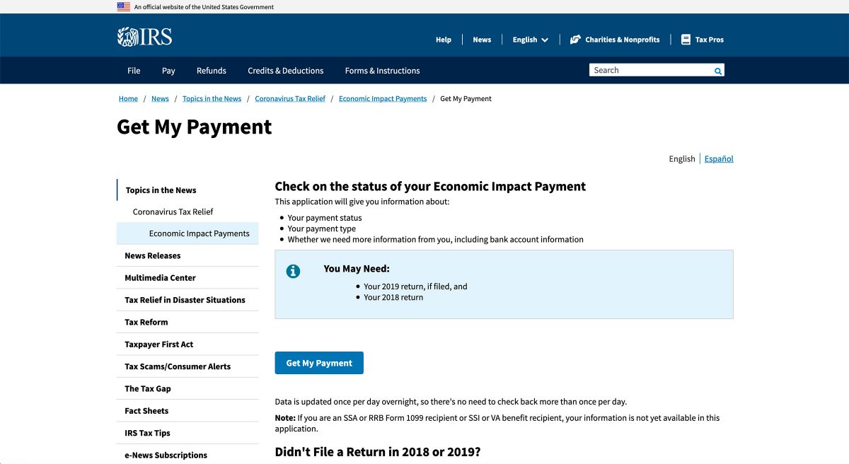
Screenshot from irs.gov/coronavirus/get-my-payment on 4/16
This is obviously a stressful time for everyone, and visiting this website is not a leisurely activity. If you’re looking for this information, that means you’re one of the many Americans who have yet to receive their payment – not an ideal position. Out of the gate, the IRS does a good job here of providing supplemental information and preparing users for the fact that they might need to have additional documentation on hand before they access the portal. Information is bulleted and visually separated for easy scanning.
The notice that “Data is updated once per day...” indicates that the IRS is aware that visitors are likely experiencing high anxiety around their results. They’re attempting to manage the resulting behavior by telling people there is “no need to check back more than once per day”, but they might get a bit farther with more empathetic language.
If you find yourself meeting your visitors in a place of high stress, approach them with language that communicates that you’re taking their needs seriously and you’re here to help.
Use Clear and Understandable Language
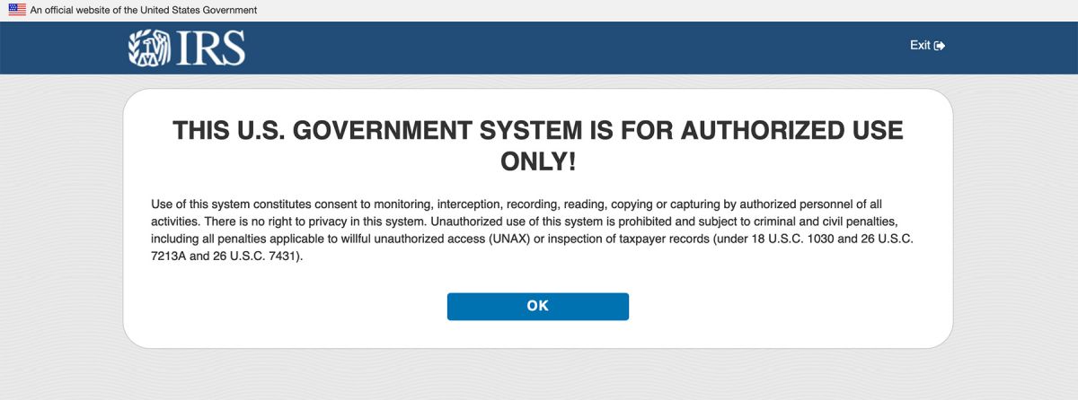
You may have legal or technical information that you need to communicate, but that doesn’t mean that you can’t lead with user-friendly language. Using accessible vocabulary is especially crucial when communicating about privacy – you can’t expect people to agree to something they don’t understand.
Manage Expectations
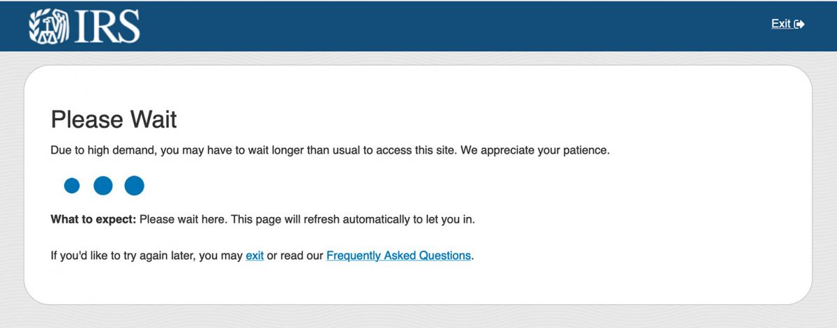
When your visitors are going to be stuck waiting longer than normal, it’s important to give them a heads up. While the IRS did a good job calling out the delays and providing the “What to expect” message, they could have taken things a step further by including information on typical wait times. This gives users a better idea of when they’ve been waiting too long and are probably headed for a timeout.
Loading graphics that provide a percentage or a representation of a visitor’s “place in line” are also much more useful than looping animations.
Let Visitors Know Their Information Is Secure
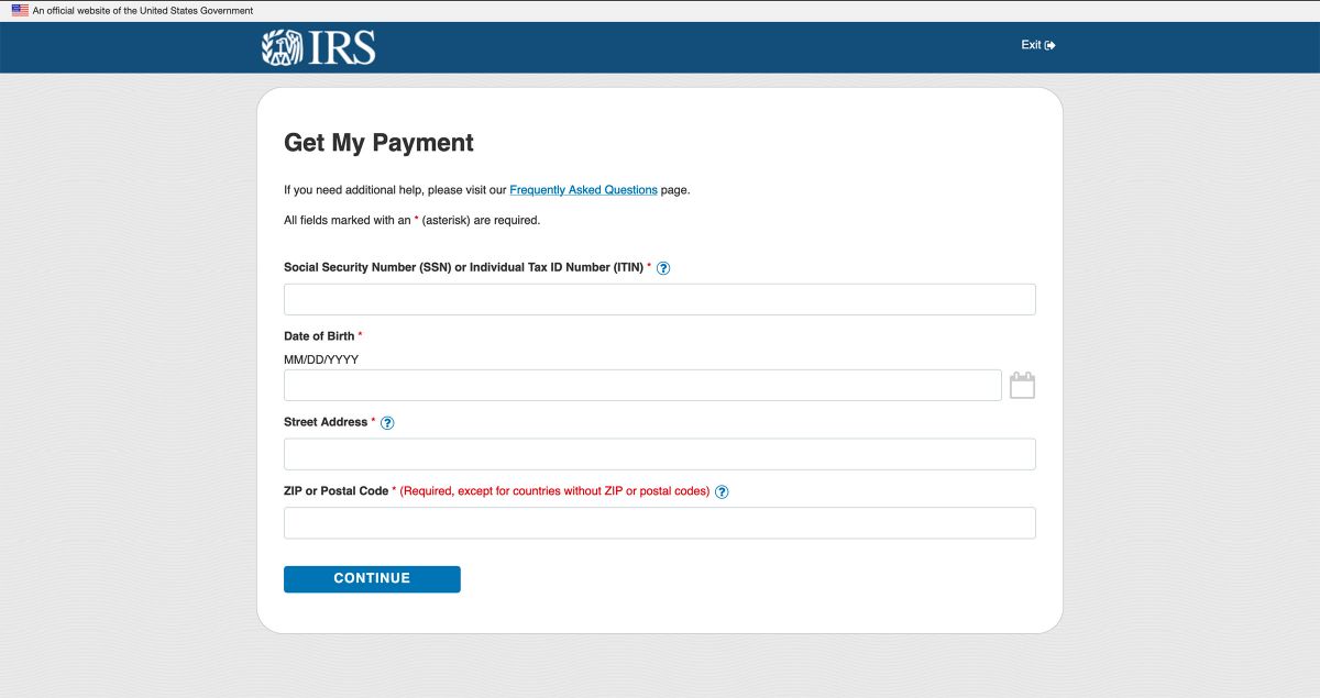
Tech-saavy users know to look for the lock icon and check that their information is being transmitted over HTTPS, but you should take steps to reassure all visitors that their sensitive personal information is being handled in a secure way. The social security number is one of the single most important pieces of data that we as Americans possess. There should be a note immediately under the field or at the top of the form communicating that this information is being handled appropriately.
Minimize Room for Error
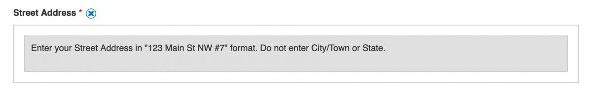
Addresses are tough to get right. Do I write “Ave.”, “AVE”, or “Avenue”? “First Floor” or just “#1”? While the help info on the Street Address field attempts to provide a little clarity on the matter, there is still too much ambiguity for me to be sure that a slight difference in formatting isn’t preventing me from getting results.
If you can, provide feedback on what’s been entered to show what corrections need to be made. You often see this on retail sites when you’re entering shipping information – “Did you mean 128 CHICAGO AVE?” That level of interactivity and detail requires geolocation information which isn’t always available to organizations, but you can always give better examples of what will and won’t work within your system. Just don’t leave your visitors to guess at the specifics of your format requirements.
Show What’s Missing and Where
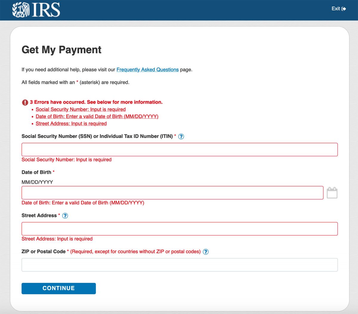
The whole point of this article isn’t just “let’s criticize the IRS”, so I’m happy to find something that they did well on this form. Required information on the form is clearly marked, and when it’s missing, the error messages display in two places. Visitors get the summary at the top with the total number of errors blocking the submission of the form, and then each individual field that’s incorrect is clearly labeled as such. Nice!
Give Specific Error Messages
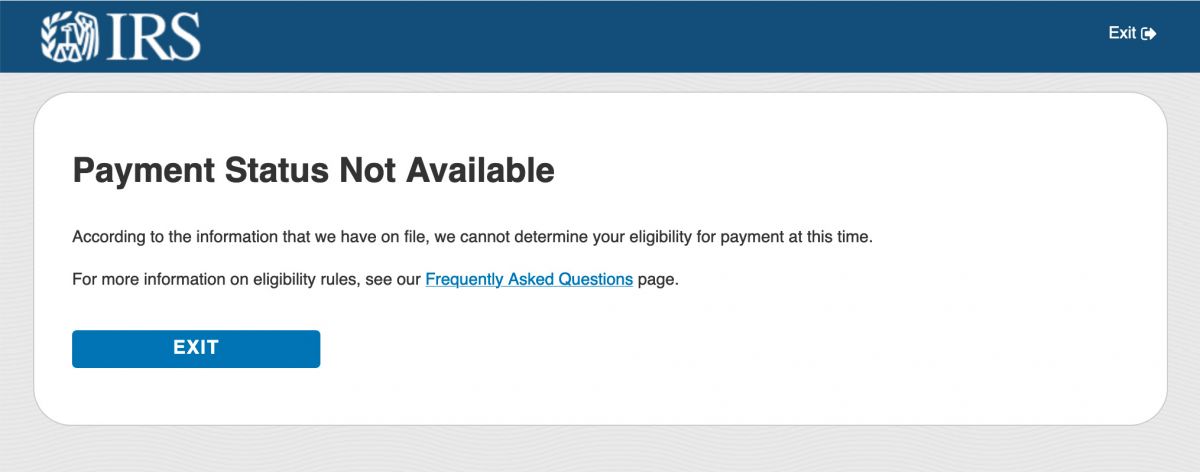
The biggest failure of this entire process comes at the end. This is the reason that “Payment Status Not Available” was trending on Twitter yesterday.
According to the IRS, receiving this error could mean any number of things: the user in question isn’t in the system, their information wasn’t entered correctly, they’re not eligible for a payment, the system wasn’t working at the time and so on and so forth. This is a terrible experience for the user that can cause unnecessary worry and frustration.
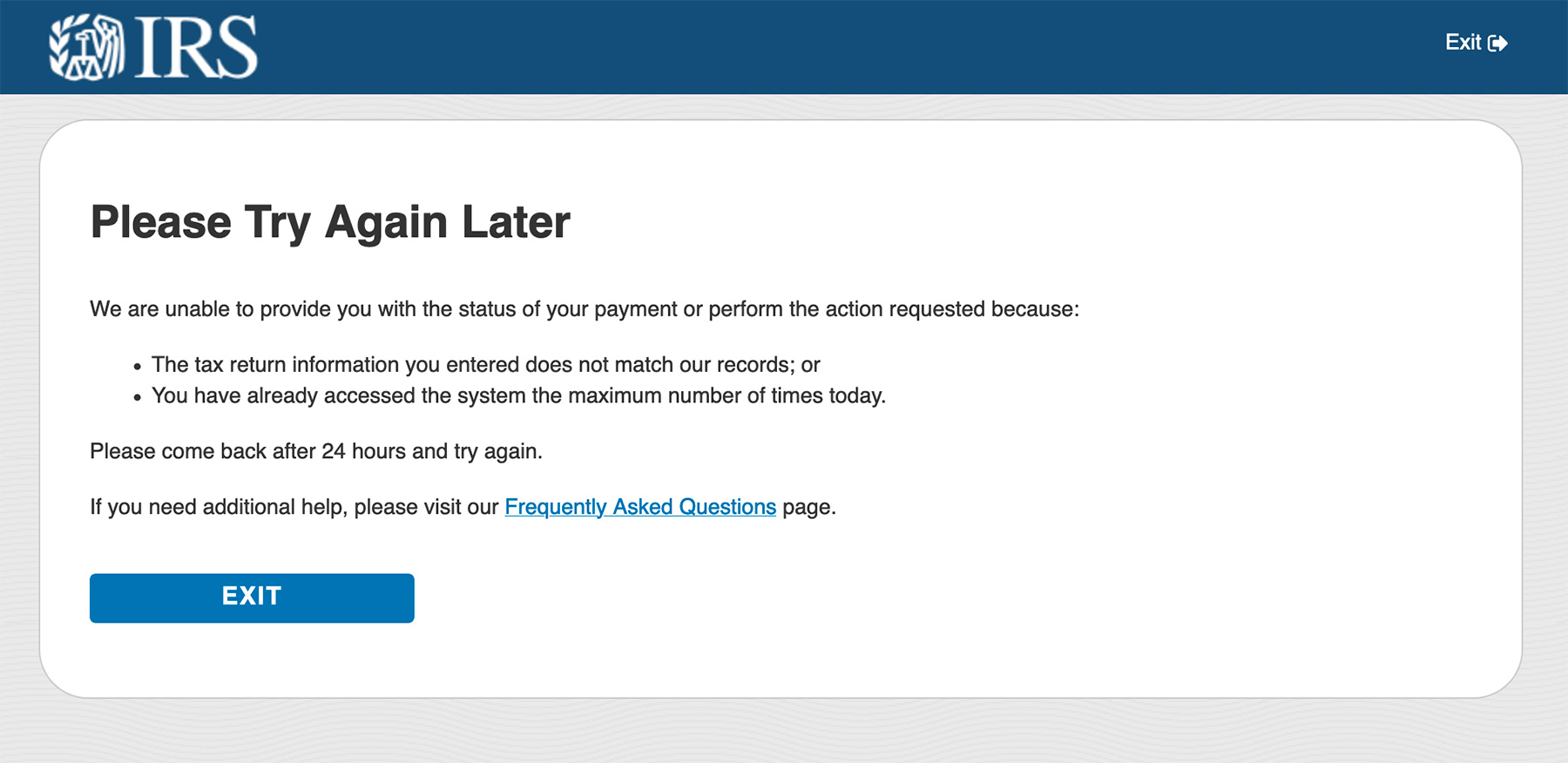
The above error message is a little narrower and potentially more helpful, but it still missed the mark. What is the maximum number of times one can access the system and what is that based on? If it’s my IP Address, why wouldn’t you tell me that before I fill in my information again? Having incorrect information and being barred from the system for 24 hours are completely unrelated issues that should never be grouped together in one error message.
Sometimes error messages are intentionally vague so that phishers and scammers can’t narrow down the reason they’re being blocked. For instance, you would tell a user “your username or password are incorrect” instead of letting them know the specifics and confirming that one piece of potentially stolen data is correct.
In this case, however, telling a visitor definitively, “your information does not match our records” is not as potentially revealing as saying “the zip code you provided does not match our records”. There’s no reason from a security standpoint not to give visitors an error message that tells them what went wrong, especially when we’re talking about something as important and stressful as people’s finances.
User Experience Is Not An Afterthought
It’s easy to look at the IRS’s stimulus payment portal after the fact and Monday-morning quarterback all the things they should have done to improve the user experience. The reality is that putting the functionality of this whole thing together (to then have it bombarded and picked over by millions of users) must have been a Herculean task. But even when we’ve made something impressive, we as developers and communicators can’t absolve ourselves of our responsibility to be clear.
This portal is a glaring example of how the “get it working first and tighten up the messaging later” approach just doesn’t fly – especially when your visitors really need what you’re offering. In fact, the greater the urgency and demand your users are experiencing, the more important it is that you use every tool in your UX arsenal to help them arrive at a positive result.