These 11 College Websites Are Living in The Future
For a long time, most college websites looked pretty similar. Apart from school colors and branding, you would have had a hard time distinguishing them from one another in any meaningful way.
Thankfully, higher ed web design has evolved to a place where standing out is becoming more valuable than fitting in.
These days, colleges and universities across the country are rejecting the staid, traditional approach to websites in favor of unique function and aesthetics that appeal to the most web-savvy group of prospective students ever to live.
Although college websites must cater to several audiences simultaneously, most administrators say that the most important audience is high school seniors. While schools have to vet students, it’s critical to remember that these uber tech-literate teens are also vetting their options. And the first step in that months-long process is usually a website visit.
So, what will they see that makes an impact? At the websites of these 11 schools, big and small, students will get a unique experience that just may be enough to inspire them to click, “Apply.”
Western Kentucky University, George Washington University, & Bates College
Awesome, Interactive Virtual Tours
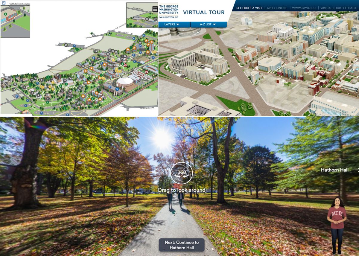
It’s important for prospective students to get a feel for the campus and the surrounding area even before their first visit. And these three schools go above and beyond to deliver an immersive, virtual tour.
WKU’s overview has a distinctive Sims-like video game feel, and GWU’s is more like a realistic, 3-D model. But both allow visitors to click around to access info and photos of key locations all around campus. GWU’s tour even features 360° photos and videos that intersperse text overlay with student interviews to really make the places come to life.
Bates takes it to the next level by simulating the traditional, live campus tour. When you scroll to the very bottom of the homepage, you’ll see a moving 360° view of a quad with a play button. As soon as you click, the tour opens and a video of a young woman pops up on the right side of the screen - she’s your tour guide who delivers handy commentary on several key locations around campus. If you can’t make it to Maine for a visit, this is definitely the next best thing.
Pasadena College
Easy as Pie Admissions Page
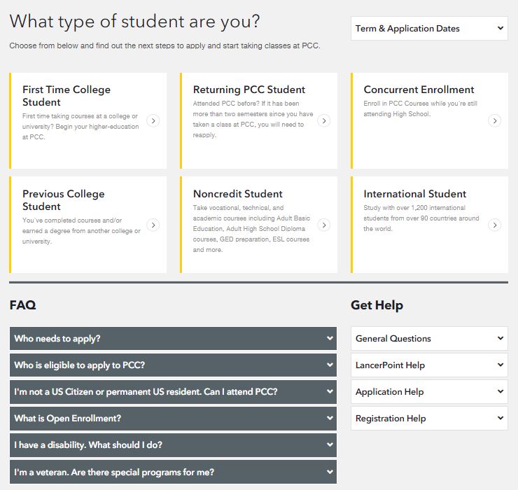
Try, for a moment, to put yourself in the shoes of today’s high school seniors. They’re just as stressed about college admissions as every generation before, but they’re more web savvy than any generation before. So, it’s no surprise that they’re quickly frustrated by clunky online application processes.
Admissions pages may not be quite as exciting as dynamic virtual tours, but they’re just as important for higher education web design. Every community college or Ivy League university out there needs to work hard, all year long, on attracting the right kind of students. And one easy win to that end is to design an admissions page that’s simple to navigate.
Pasadena College makes it easy by first asking visitors to self select from six student types. There’s no guessing about where to go here - it’s obvious. Below the choices are links to FAQs and relevant help channels. Once you choose, you get taken to a page that breaks down every step in the admissions and enrollment process. There are even buttons to download or email yourself the steps! If you’ve ever wondered how web design can be considerate or sympathetic, this is it.
University of Maryland
Breaking the Homepage Layout Mold
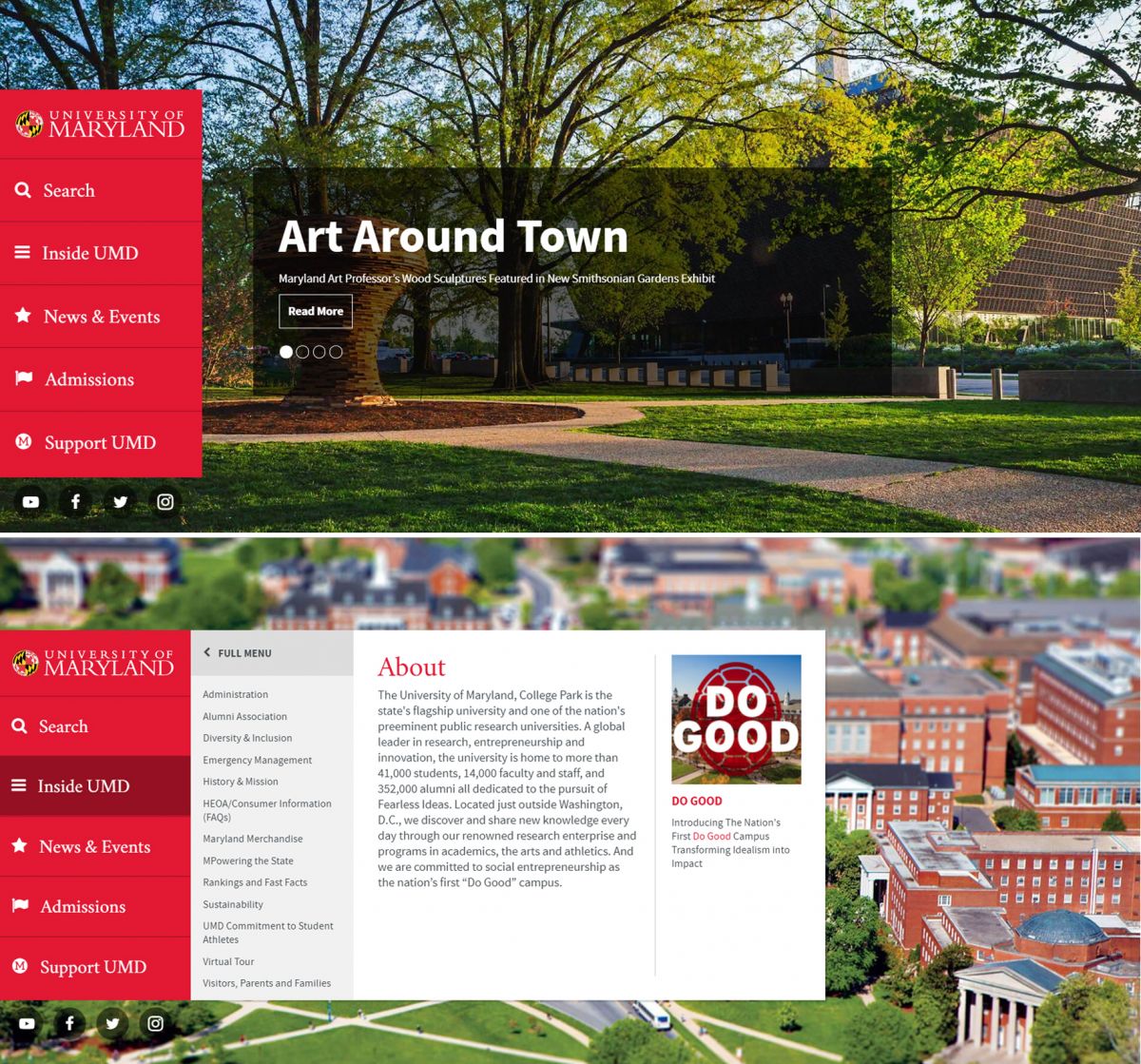
Lots of university websites are eschewing the traditional homepage layout and opting for designs with a more modern feel. University of Maryland has taken that idea to the next level by completely wiping out the navigation from the top of the page. Instead, their main menu is a sticky, graphic element that follows you down the page as you scroll through one, giant, engaging photo after another.
As you reach each image section of their home page, another element slides out from the sidebar menu to feature different, relevant submenus and text blurbs. Although this might be a little disorienting for older users, teenagers would find this intuitive and fun to use. This is a masterclass in directing visitors where you want them to go as opposed to overwhelming them with a complex navigation at first glance.
Bucknell College
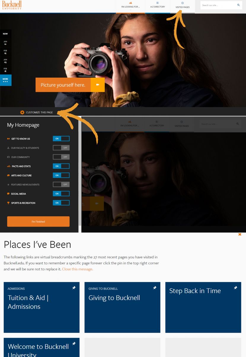
Choose-Your-Own Homepage Adventure
With so many different audiences, how do college websites manage to be all things to all people? The jury may still be out on that, but schools like Bucknell are starting to find creative solutions to customizing the experience.
It’s not so prominent as to get in the way of their beautiful homepage design, but if you look right at the fold, you’ll notice a small gear icon with the words, “Customize this page.” When you click on it, a menu of options slides in from the left to reveal eight features that visitors can choose to include or exclude from their personalized homepage. This is pretty handy for current students and faculty who visit the site a lot and may not always want to see promotional content.
But wait, there’s more! In the purposefully minimalist header menu, there’s a button for “Visited Pages,” which displays the last 27 pages you viewed. You can even pin ones that you always want to appear there. This is another incredibly thoughtful feature that shows the site was designed around the real ways various audiences use websites.
Rhode Island School of Design & University of North Carolina School of the Arts
A Fittingly Artsy Vibe
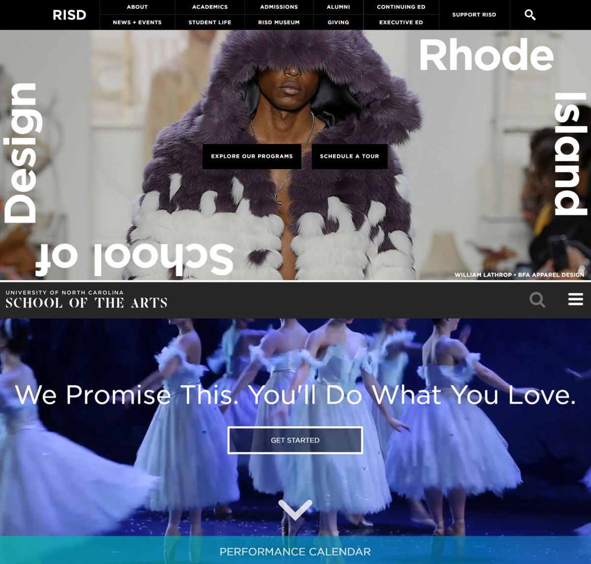
Smart, niche schools have figured out how to design their sites around their unique students and we’re totally here for it. After all, shouldn’t a school’s online presence reflect its values and student body? Colleges like RISD and UNCSA think so and have given their sites a fittingly artsy vibe.
Both sites have a minimal, clean aesthetic heavy on black and white, giving them the feel of an online portfolio. More importantly, both sites emphasize student work and student experience over the institution’s news or accolades. More schools could learn something from this approach that draws visitors in by connecting to the real output colleges have.
If you were an art student looking for a cool, open environment to grow in, wouldn’t you be intrigued by a site that puts the focus on student artists? I know I would!
Middlebury College
A Graphic Nav Like You’ve Never Seen
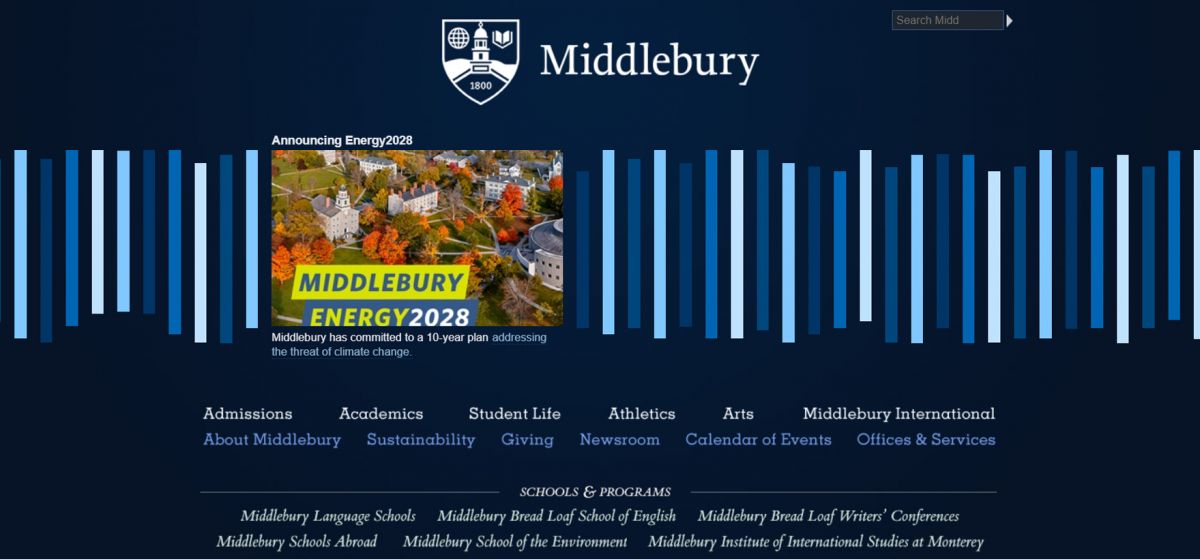
If this small, liberal arts college wants to stand out from the pack from Jump Street, they’re on the right track with an unusual navigation that’s front and center on the homepage.
One of the first things you’ll notice is that there is no “below the fold” on the homepage. The majority of the valuable real estate is taken up by blue and white bars of varying heights. When you click on a bar once, it expands to display an image and text snippet that includes a link to more info. It looks like most, if not all, of these are links to news stories.
To get to the static pages, you’ll find a traditional menu below. It’s interesting to note that nearly every other school on this list features edge-to-edge design with large images on the homepage. Although that is the standard for modern website’s right now, it’s intriguing to see a school that opts for another approach to looking fresh and modern.
Oberlin College & Conservatory
A Homepage That Knows Its Audience
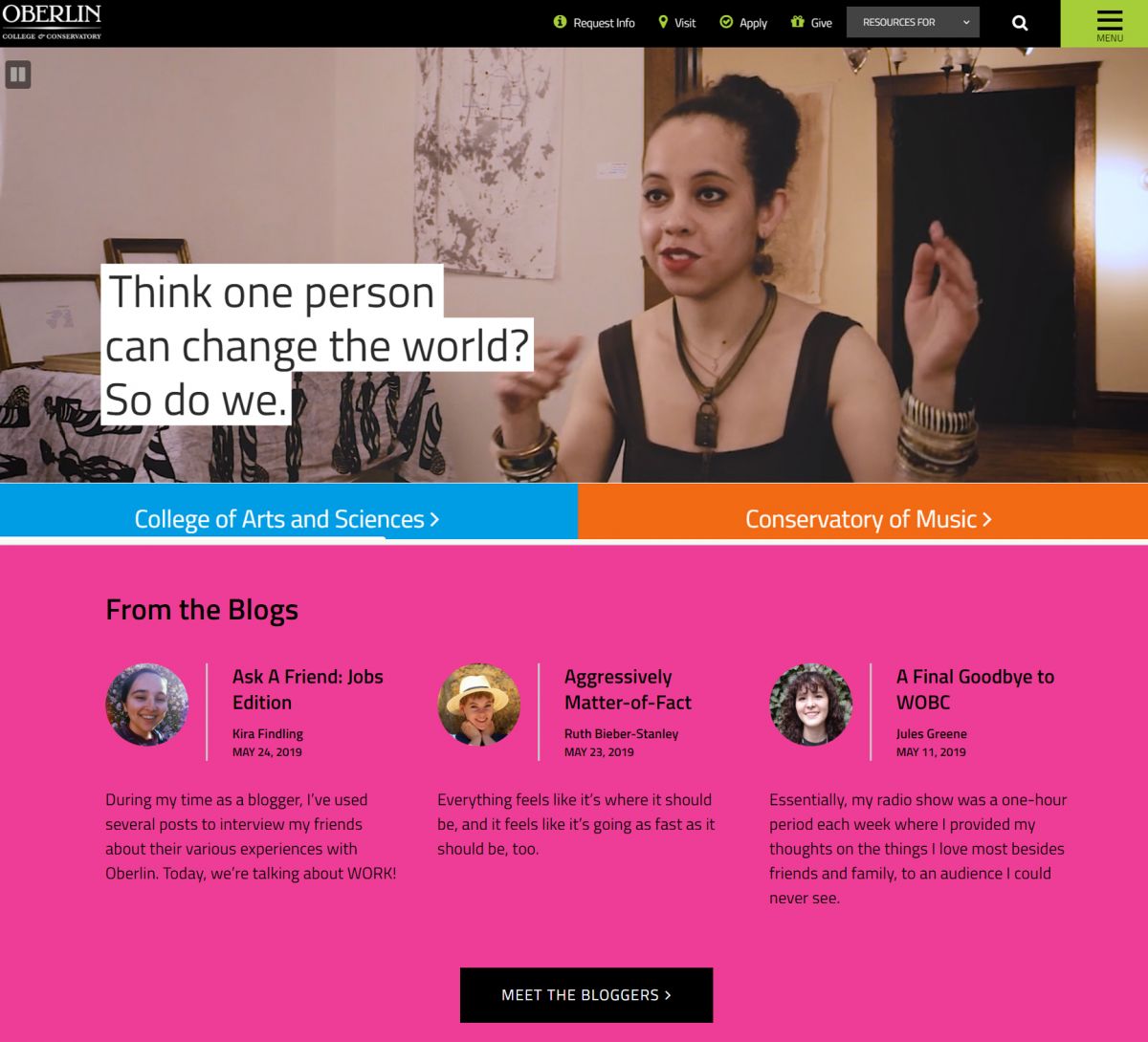
Traditional, prospective college students are antsy teenagers who salivate at the mere glimpse of real college life. Oberlin, a famously progressive liberal arts school, clearly gets that. The colorful homepage is light on text and heavy on videos and photos that showcase students and student life. And if you look closely, you’ll notice that the quality of the video has that slightly muted, overexposed, faux vintage feel that’s reminiscent of Instagram posts.
They even have a block that features student bloggers, emphasizing the notion that students’ voices matter at Oberlin. Generally, we love how unashamed this site is to cater to their target audience. Instead of a mediocre effort to appeal to everyone, they turn their full focus to knocking the socks off prospective students, and it works.
Feirstein Graduate School of Cinema
A College Website That Doesn’t Feel Like One
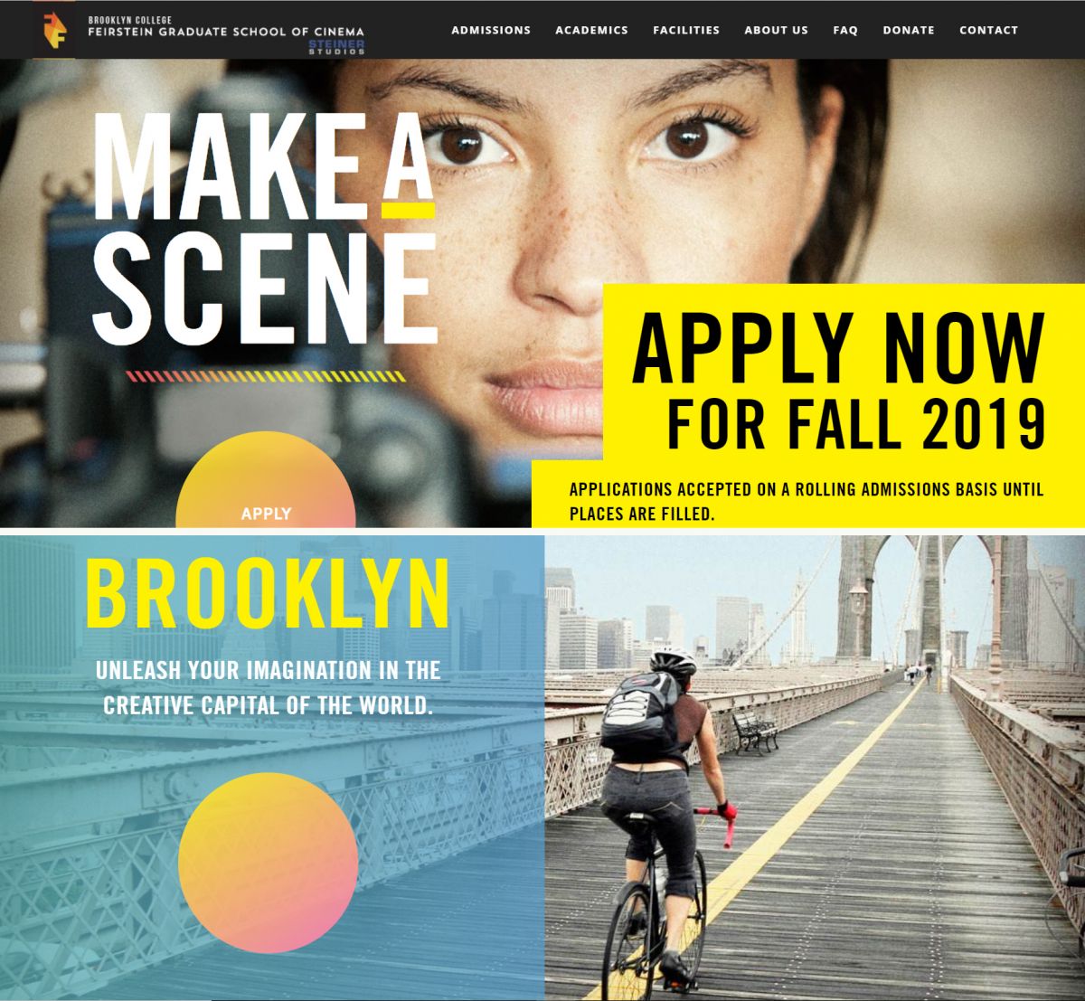
The prospective students of a graduate film school are a far cry from the prospective students of most other colleges. So it’s nice to see that was taken into account when creating this standout site. In fact, the feel of the design has more in common with something like NYLON than NYU.
One of the biggest things that makes this website unique is the giant, all-caps type that’s splashed across the large images, all of which have an almost grainy, film-like feel. The gradient color design elements provide a nice balance by bringing a needed softness to the design. It all comes together to create a very modern, hip vibe that speaks to artistically minded, future filmmakers.
Let UX Be Your Guide
Clearly, we’re a little bit obsessed with college website design. There’s just something about the world they’re creating online that fascinates us and leaves us asking how we can make it even better.
The challenge that we and all college website designers have is to push forward-thinking designs without compromising the user’s experience. Put simply, just because something is cool or cutting-edge doesn’t mean that it best serves your audience.
Higher ed institutions should consider interesting ways to make their websites stand out while also being wary of acting as a guinea pig for a design firm that just wants to beef up their portfolio. If you’re ever on the fence about a new website feature, let the answer to this question be your guide: “Will this feature improve the user’s experience?”
If you’d like to check out some of the work we’ve done for higher ed web design, head over to