
16 Website Trends in Commercial Construction 2022
See our 2023 post on Web Design Trends in Commercial Construction
When it comes to web design, there are very few hard and fast rules you have to follow.
However, there are several guidelines that you should follow if you want to help visitors have a great experience on your website. Put simply, the easier your website is to navigate, the more likely potential customers will be to trust you and take the next steps.
There’s always the option to step away from the pack and do something completely different. But in presenting something that’s unfamiliar, you risk confusing or frustrating visitors. So, it’s always wise to take the time to see what other companies in your industry are doing.
We saved you some time by studying the websites of the top 50 construction companies in the US.
Next, we created a list of 15 different web practices that are common in construction industry web design. Finally, we looked at each of the 50 construction websites to see whether or not they followed these standards.
We used Nielsen Norman Group’s definition of standardization as follows:
Standard: 80% or more of websites use the same design approach. Users strongly expect standard elements to work a certain way when they visit a new site because that's how things always work.
Convention: 50–79% of websites use the same design approach. With a convention, users expect elements to work a certain way when they visit a new site because that's how things usually work.
Confusion: with these elements, no single design approach dominates, and even the most popular approach is used by at most 49% of websites. For such design elements, users don't know what to expect when they visit a new site.
Left Aligned Logo = Standard
Yes: 92% | No: 8 %
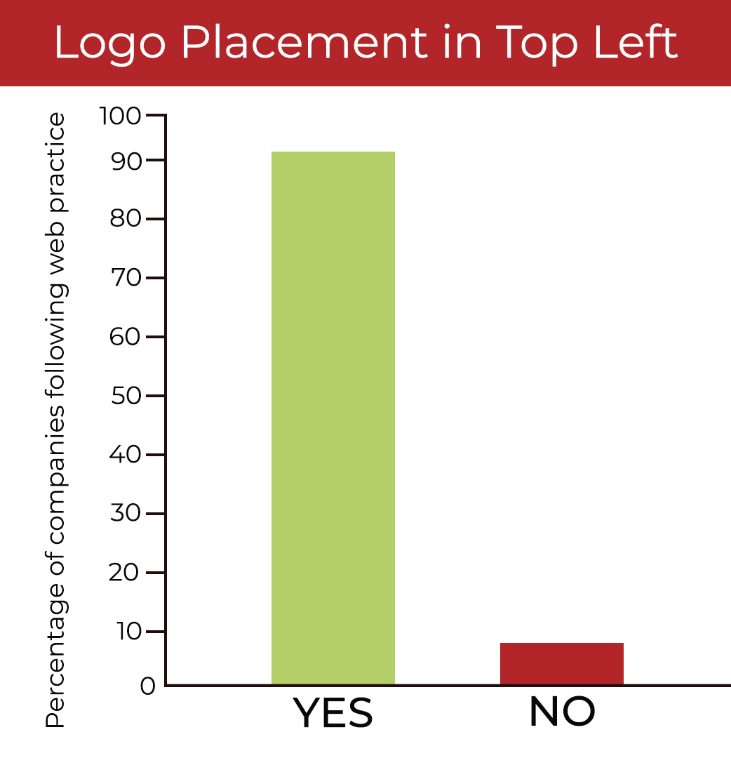
No matter the industry, almost all business websites you visit have the company’s logo positioned in the top left. And it’s almost always clickable and will result in being navigated back to the homepage.
It was somewhat surprising that 8% of the top 50 construction websites did not adhere to this standard. Although there are lots of ways to stand apart, we would not advise deviating from the logo placement norm.
Contact in Top Right = Convention
Yes: 52% | No: 48%
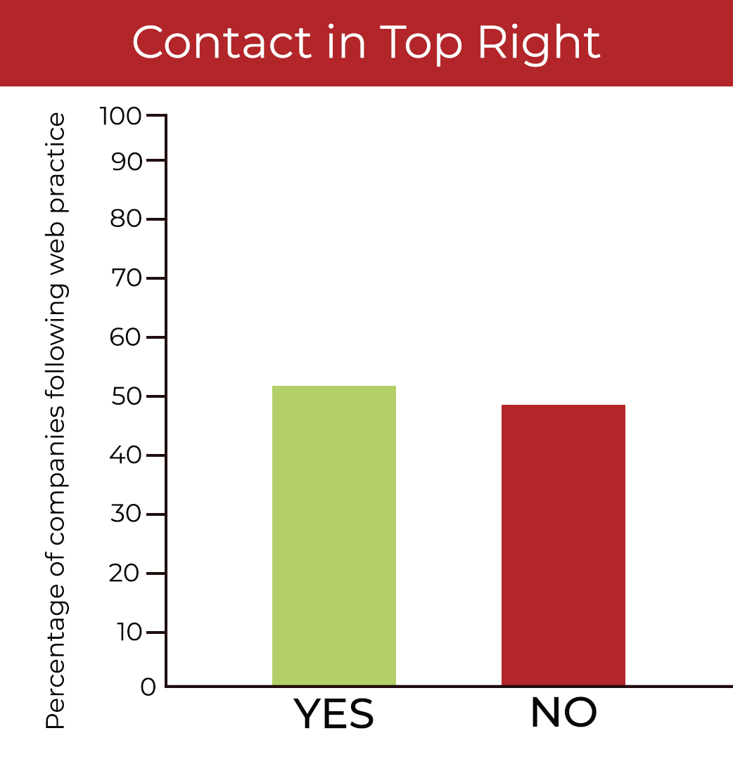
After years of navigating websites, most users expect to find a contact button in the top right of your website’s menu. Studies have shown that our eyes tend to move in a Z pattern as we scan a website for critical info. So it makes perfect sense that the company’s logo would be in the top left and the contact button in the top right.
Yet it seems that this practice is far from standard among top construction companies. Whatever you decide to do, just keep in mind that the last thing you want is a visitor to have to hunt around to find how to get in touch with you. If they have to work too hard at it, they may abandon the idea entirely.
Horizontal Navigation Bar = Convention
Yes: 76% | No: 24%
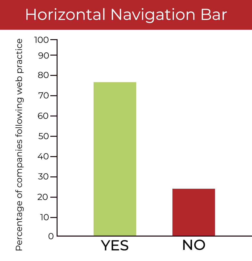
Although more and more companies are using hamburger menus (3 horizontal bars that, once clicked, expand to reveal the menu), 76% of top construction company websites use a horizontal menu along the top of the screen, so this is currently a convention rather than a standard.
When deciding whether to use a visible or hidden navigation like the hamburger menu, you may want to review Nielsen Norman Group’s research on how hidden navigation impacts user experience.
Homepage Slideshow = Convention
Yes: 56% | No: 44%
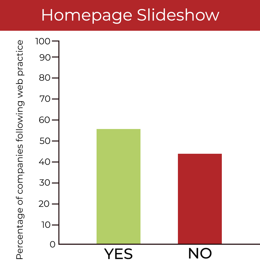
For a long time, the homepage slideshow was the norm in web design among almost all industries. However, these numbers are a clear indication that this is no longer a standard. The companies who have chosen not to feature a slideshow are instead opting for videos or dynamic single images.
If you’re on the fence about whether or not to feature a slideshow on your homepage, it’s worth reviewing this study, which shows that this may not be as effective as you might think.
Clear Value Proposition High on Homepage = Convention
Yes: 58% | No: 42%
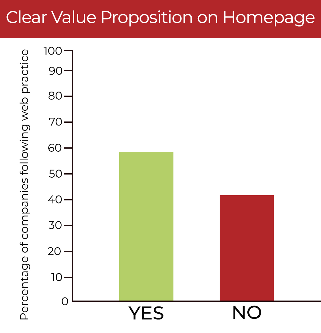
Only 58% of the construction company websites we assessed featured what we would consider a clear value proposition in a prominent position on their homepage. Although this is not a standard in the industry, we believe that it ought to be.
We found that many couched their value proposition in rather vague language that could apply to a wide variety of businesses. The strongest statements were ones that specifically stated what the company does and why they’re the best at it.
Prominent Call to Action on Homepage = Confusion
Yes: 8% | No: 92%
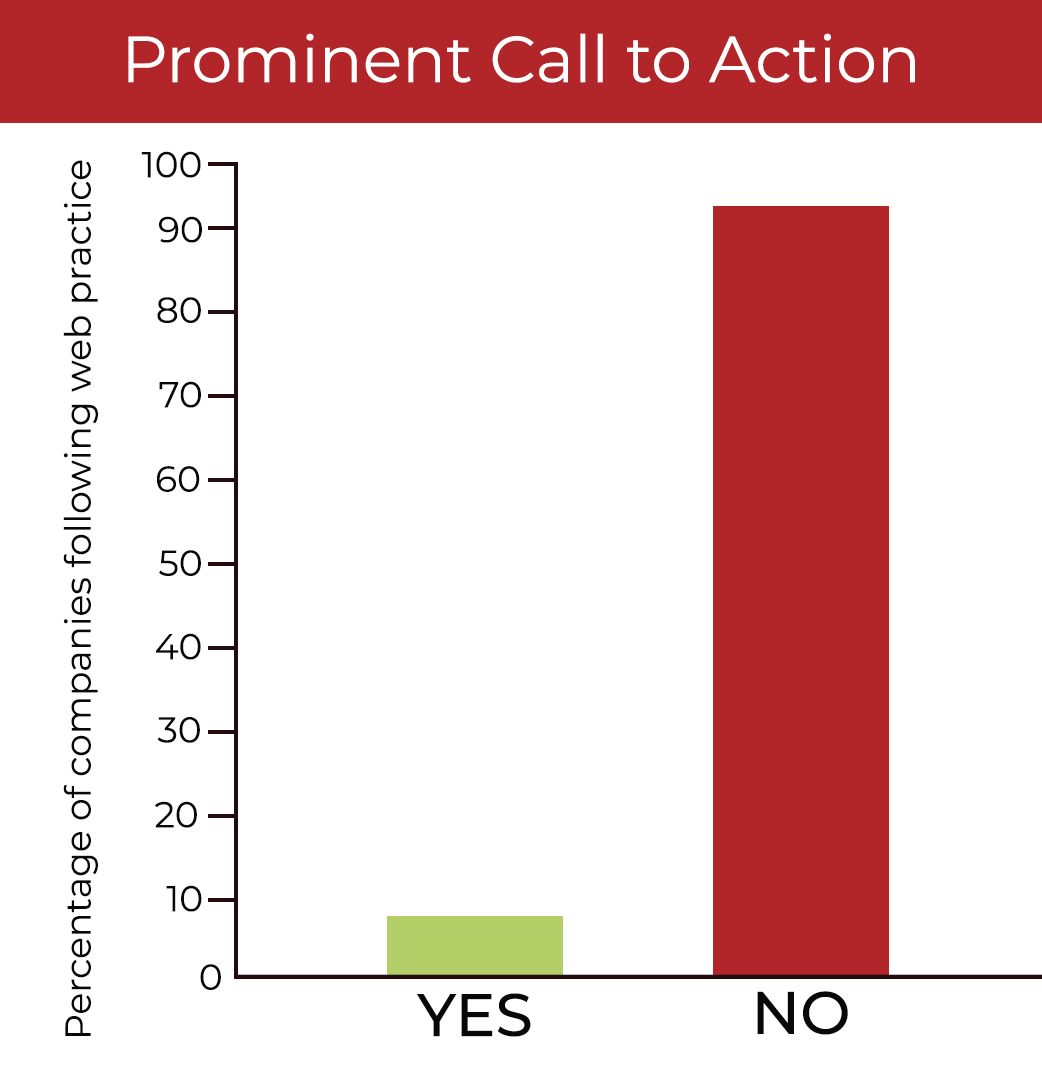
It was a bit shocking to see that only 8% of the websites we examined had a prominent call to action (CTA) on their homepage. For the purposes of this study, we did not consider things like, “Read more” or “Learn more” to be calls to action.
By our definition, a CTA is an invitation to take a concrete step in your sales process. This could be anything from scheduling a call to downloading an informational PDF to completing an intake form. The bottom line is this - if you want someone to complete a certain task on your website, be clear about what it is and how to do it.
Featuring Projects = Standard
Yes: 100% | No: 0%
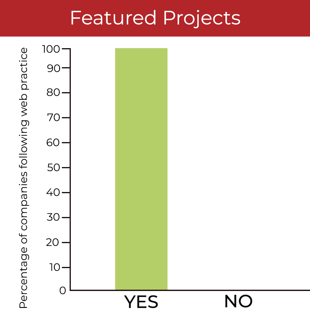
Clearly, featuring a portfolio of completed projects is a standard in the construction industry. And we’re not surprised. For companies that make things, the proof is in the pudding, so it’s always a good idea to put your work front and center on your website.
Header Search Feature = Convention
Yes: 68% | No: 32%
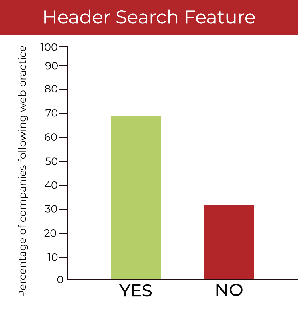
Many users prefer to navigate a site through search, especially if they’ve come to your site with a very specific task. For that reason, it’s helpful to have a prominent search box in an obvious location.
While some put it in the footer or other locations, the majority of websites we studied do feature their search box in the header so it can’t be missed. According to Nielsen Norman Group, a search box in the top right corner is the ideal setup.
Newsletter Signup in Footer = Confusion
Yes: 12% | No: 88%
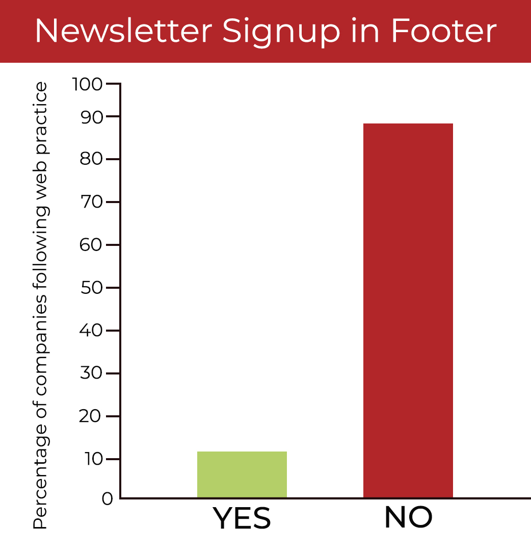
Once upon a time in web design, newsletter signups in the footer were ubiquitous. However these days in the construction industry, they’re far from common. Only 12% of the 50 sites we looked at had a newsletter signup in the footer.
Whether or not you choose to include this in the footer or elsewhere really depends on how active you are with email marketing and communications. If email marketing is effective for your company, consider adding an incentive to the signup, like an informative PDF that will be sent upon signup.
Social Media Links in Footer = Standard
Yes: 84% | No: 16%
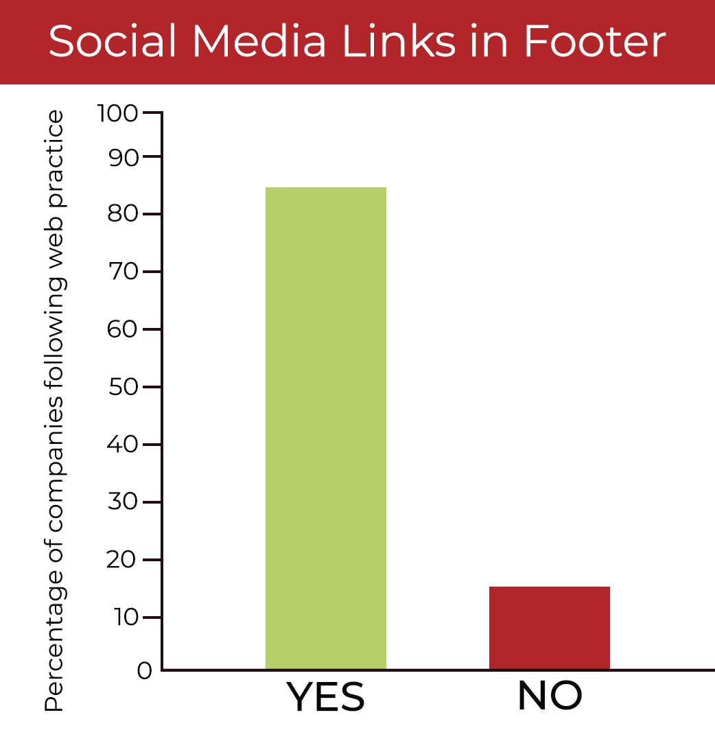
At one point, we’d often see social media links featured in the header of business websites. Thankfully, however, it looks like moving them to the footer has become a standard in the construction industry.
The idea of putting them in a less prominent position is that we don’t want visitors to leave our website soon after they’ve arrived there. The footer is a good place for them because they’re still easy to find on every page, but not distracting.
Services Listed = Standard
Yes: 86% | No: 14%
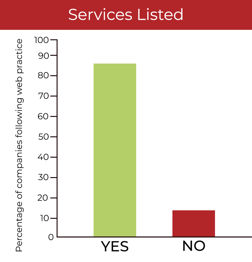
Providing a list of the services a construction company offers is a standard. For some, this could be done to improve clarity for visitors while others may be guided by SEO.
If someone were to Google a specific service, you would want to do everything you can to increase your chances or ranking for that search. And having an optimized page dedicated to that service would be a great way to improve your search rankings.
Sectors or Industries Listed = Standard
Yes: 96% | No: 4%
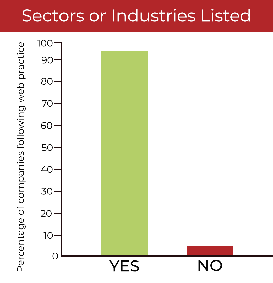
Nearly all construction company websites we assessed featured the markets, sectors or industries they work in. There’s some variety in terms of the format of this list, but many employed it as a filter or categorization in their project portfolio. Including industry keywords and featuring a clear list of projects in each industry is great for both SEO and user experience.
Career Section in Main Navigation = Standard
Yes: 88% | No: 12%
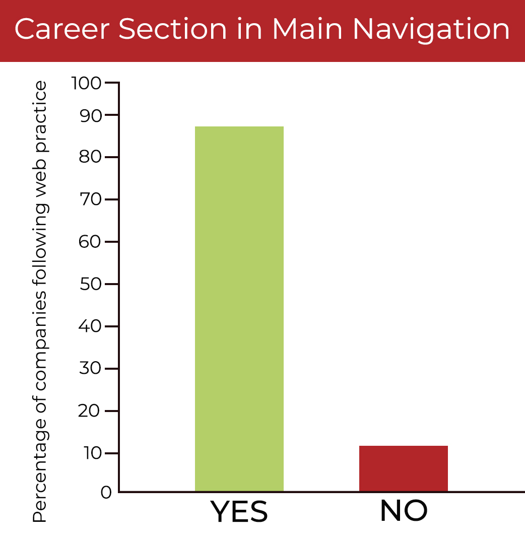
It’s clear to see from these numbers that for many construction companies, recruiting excellent job candidates is a top priority. Given that it is a standard, job seekers will likely expect to find your career page in the main menu, so it’s not advisable to place it in a location they’ll have to work harder to find.
Cookie Disclosure = Convention
Yes: 50% | No: 50%
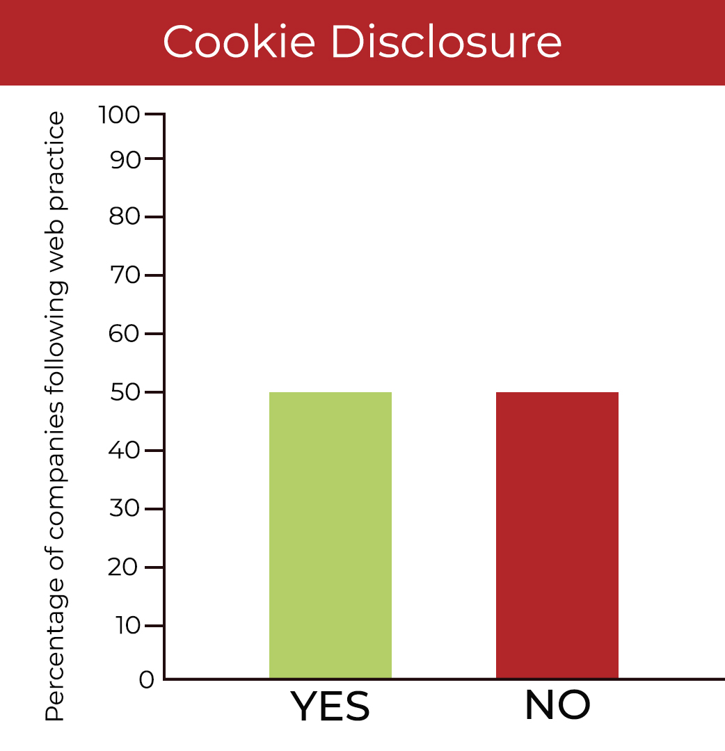
We were not too surprised to see an even 50/50 split on this since new laws like GDPR in Europe and CCPA in California are still relatively new and limited to certain locations. While your company may still be able to safety avoid having disclosures of your data collection policies, it’s something that should definitely be on your radar and your website to-do list in the near future.
Fast Facts on Homepage = Confusion
Yes: 12% | No: 88%

Having a featured section of fast facts seemed to be a trend for a while in the construction industry. And we can understand why - it was a quick way to show some impressive statistics about the breadth and depth of a company’s work. However, it seems to be a trend that has all but disappeared in the top construction company websites we studied.
Awards Displayed on Homepage = Confusion
Yes: 10% | No: 90%
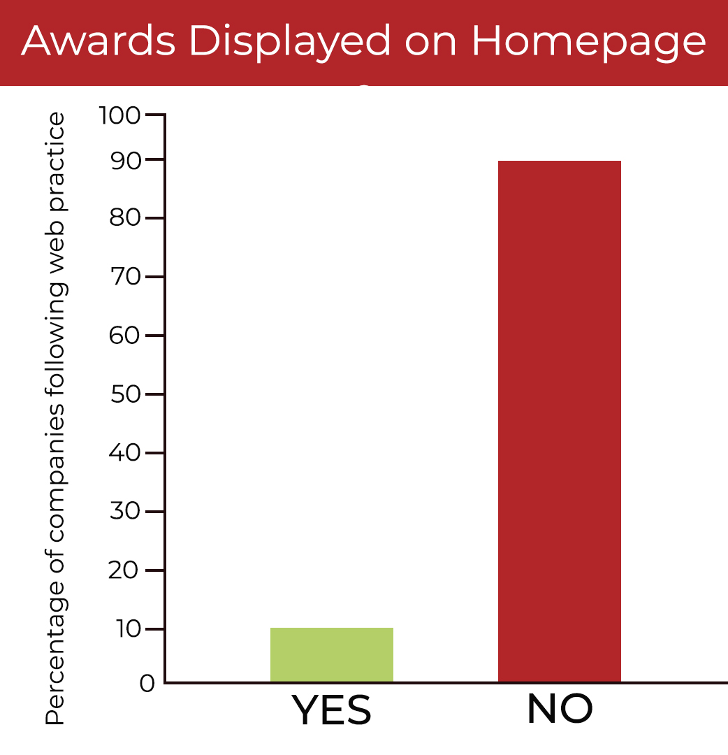
As with the fast facts section, displaying award icons on the homepage is no longer the norm. If your company would like to move away from this practice, you may want to consider adding award icons to individual projects that have received recognition.
No One Size Approach
We hope this research is illuminating for you as you make decisions about your construction website and how you want to represent your company. It should be noted, though, that there is never a one-size-fits-all approach. The fact is, your company is unique.
So, while you may see that 85% of the top 50 construction companies do one thing or don’t do another, it shouldn’t be a foregone conclusion that you must follow suit. The key is to look at these practices, consider their purpose and their impact, and make an informed decision about what’s right for your company.